The Analytical Overview of the Main Currency Pairs on 2022.08.23

By JustForex

The EUR/USD currency pair

Technical indicators of the currency pair:
  • Prev Open: 1.0035
  • Prev Close: 0.9942
  • % chg. over the last day: -0.93%

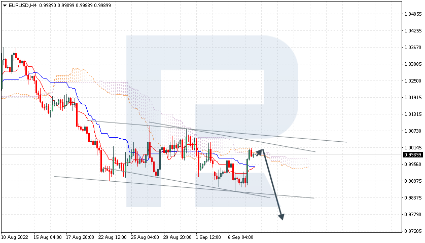
The dollar index continues to strengthen as several Federal Reserve officials reiterated an aggressive stance on monetary policy tightening ahead of the Fed’s symposium in Jackson Hole. As investors are now clearly expecting a relatively hawkish message from Fed Chairman Jerome Powell in Jackson Hole on Friday, there is a sell-off in risky assets and a buy of defensive ones. The euro is also negatively affected by the energy crisis in Europe. As a result, the euro fell to a 20-year low yesterday.

Trading recommendations
  • Support levels: 0.9806
  • Resistance levels: 0.9990, 1.0112, 1.0146, 1.0230, 1.0286, 1.0365

From the technical point of view, the trend on the EUR/USD currency pair on the hourly time frame is bearish. The euro continues to lose ground. The MACD indicator is in the negative zone, and sellers’ pressure is still high. Under such market conditions, it is better to look for buy trades on the intraday time frames from the support level of 0.9806, but with a confirmation in the form of reverse initiative. Sell trades can be considered from resistance levels of 0.9990, but only after the additional confirmation.

Alternative scenario: if the price breaks out of the 1.0146 resistance level and fixes above, the uptrend will likely resume.

EUR/USD
News feed for 2022.08.23:
  • – Eurozone French Manufacturing PMI (m/m) at 10:15 (GMT+3);
  • Eurozone French Services PMI (m/m) at 10:15 (GMT+3);
  • – Eurozone Germany Manufacturing PMI (m/m) at 10:30 (GMT+3);
  • – Eurozone Germany Services PMI (m/m) at 10:30 (GMT+3);
  • – Eurozone Manufacturing PMI (m/m) at 11:00 (GMT+3);
  • – Eurozone Services PMI (m/m) at 11:00 (GMT+3);
  • – US Manufacturing PMI (m/m) at 16:45 (GMT+3);
  • – US Services PMI (m/m) at 16:45 (GMT+3);
  • – US New Home Sales (m/m) at 17:00 (GMT+3).

The GBP/USD currency pair

Technical indicators of the currency pair:
  • Prev Open: 1.1816
  • Prev Close: 1.1764
  • % chg. over the last day: -0.44%

The pound sterling and inflation rates have fallen to record levels due to the UK energy crisis. The British currency against the dollar fell to its lowest level since March 2020. Traders are increasingly concerned about a prolonged decline in energy supplies, exacerbating inflation, which is already at its highest level in decades. The UK also faces uncertainty over government policy as a new prime minister will be elected next month. Weak PMI data today could further exacerbate the sell-off in the pound. HSBC Bank Plc expects the British currency to trade at $1.16 in the first quarter of 2023.

Trading recommendations
  • Support levels: 1.1659
  • Resistance levels: 1.1801, 1.1903, 1.2000, 1.2035, 1.2167, 1.2215, 1.2294

From the technical point of view, the trend on the GBP/USD currency pair on the hourly time frame is bearish. The price is trading below the moving averages, indicating selling pressure. The MACD indicator has become negative, but there are signs of divergence. At the moment, it is better to look for sell trades from the resistance level of 1.1801, but only after the additional confirmation. Buy trades can be considered on intraday time frames from the support level of 1.1659, but only with confirmation.

Alternative scenario: if the price breaks out through the 1.2006 resistance level and fixes above, the uptrend will likely resume.

GBP/USD
News feed for 2022.08.23:
  • – UK Manufacturing PMI (m/m) at 11:30 (GMT+3);
  • – UK Services PMI (m/m) at 11:30 (GMT+3).

The USD/JPY currency pair

Technical indicators of the currency pair:
  • Prev Open: 136.85
  • Prev Close: 137.49
  • % chg. over the last day: +0.47%

The USD/JPY quotes are trading near a 52-week high. The growth of the dollar index against the background of the US Federal Reserve’s tightening of the monetary policy on the one hand and the adaptive soft monetary policy of the Bank of Japan, on the other hand, contribute to the growth of USD/JPY quotes. The Business Activity Index in the manufacturing and services sectors dropped below 50, indicating a serious slowdown in business processes in Japan.

Trading recommendations
  • Support levels: 135.89, 135.35, 134.23, 133.47, 132.27, 131.08, 130.85
  • Resistance levels: 137.43, 138.25

From the technical point of view, the medium-term trend on the currency pair USD/JPY is bullish. The USD/JPY quotes continue to grow steadily, breaking through all the resistance levels. Under such market conditions, buy trades can be sought from the support level of 135.89, but with additional confirmation. For sell deals, it is possible to consider the resistance level of 137.43. Still, only with additional confirmation in the form of a reverse initiative, as fundamentally, USD/JPY quotes are inclined to grow.

Alternative scenario: If the price fixes below 135.35, the downtrend will likely resume.

USD/JPY
News feed for 2022.08.23:
  • – Japan Manufacturing PMI (m/m) at 03:30 (GMT+3);
  • – Japan Services PMI (m/m) at 03:30 (GMT+3).

The USD/CAD currency pair

Technical indicators of the currency pair:
  • Prev Open: 1.2981
  • Prev Close: 1.3052
  • % chg. over the last day: +0.55%

The Canadian dollar is under pressure as the dollar index rises and oil prices plummet. The Canadian dollar is a commodity currency, so it depends not only on the decision of the Canadian Central Bank but also on oil prices. Fears that Iranian oil may return to the world market have caused crude oil prices to approach six-month lows on Monday.

Trading recommendations
  • Support levels: 1.3006, 1.2900, 1.2858, 1.2809, 1.2761
  • Resistance levels: 1.3090, 1.3105

From the point of view of technical analysis, the trend on the USD/CAD currency pair is bullish. The MACD indicator is in the positive zone, and the buyers’ pressure remains, but there are signs of divergence. Under such market conditions, buy trades should be considered on the lower time frames from the support level of 1.3006, but only with confirmation. For sell deals, it is better to consider the resistance level of 1.3105 but also with a confirmation in the form of a reverse initiative.

Alternative scenario: if the price breaks down and consolidates below the 1.2903 support level, the downtrend will likely resume.

USD/CAD
There is no news feed for today.

By JustForex


This article reflects a personal opinion and should not be interpreted as an investment advice, and/or offer, and/or a persistent request for carrying out financial transactions, and/or a guarantee, and/or a forecast of future events.
Stock indices fall ahead of the Jackson Hole symposium

By JustForex

US indices fell sharply on Monday as rising market sectors, including technology and consumer goods, came under pressure from rising Treasury bond yields amid fears that Federal Reserve Chairman Jerome Powell will deliver a hawkish surprise at the annual symposium in Jackson Hole. As the stock market closed Monday, the Dow Jones Index (US30) decreased by 1.91%, and the S&P 500 Index (US500) fell by 2.14%. The NASDAQ Technology Index (US100) lost 2.55% yesterday.

Richmond Federal Reserve President Thomas Barkin said on Friday that US Central Bank officials still have plenty of time before they need to decide how much to raise interest rates in September. The recovery in US stocks is inspiring confidence among investors. The S&P 500 (US500) rebounded about 16% from its low after its worst first half since 1970, helped by stronger-than-expected corporate earnings, and hopes the economy can avoid a recession.

The focus for investors this week is Fed Chairman Jerome Powell’s Friday speech at the Central Bank conference in Jackson Hole to get additional signals on how aggressive the Fed may be in raising interest rates. Analysts believe that Powell will try to sound hawkish about lowering inflation expectations and tightening financial conditions. That’s why there is a negative catalyst in the market right now.

Stock markets in Europe were mostly down yesterday. German DAX (DE30) decreased by 2.32%, French CAC 40 (FR40) was 1.80% lower, Spanish IBEX 35 (ES35) lost 0.64%, British FTSE 100 (UK100) closed in minus on Monday by 0.22%.

The European Central Bank should keep raising rates even if a recession in Germany is becoming more likely because inflation will remain unacceptably high until 2023, Bundesbank President Joachim Nagel told a German newspaper. The Eurozone economy continues to move towards recession. European energy prices are soaring because of a hot summer and fears that Russia is using energy exports as a weapon against the bloc. EU indices fell after Russia announced a three-day shutdown of gas supplies to Europe via the Nord Stream 1 pipeline later this month. Investors fear the shutdown could exacerbate the energy crisis.

Analysts believe the Bank of England won’t be able to raise rates further because of the weak economy. Britain’s high inflation rate in recent decades and last week’s drop in consumer confidence increased the possibility that the country is headed for stagflation.

Speculation that the Fed would decide to raise rates by 75 basis points in September instead of 25 led the dollar to rise for the fourth straight day and to a six-week high. That sent gold and silver down as US government bond yields rose as the dollar index rose, and the precious metals have an inverse correlation to that indicator.

Fears that Iranian oil may return to the world market led crude oil prices to near six-month lows on Monday. As a result, the head of OPEC, Saudi Arabia’s top representative, threatened to cut output if the oil market continued to fall. Israel actively opposes the renewal of the deal between the US and Iran. Israel is alarmed by the growing likelihood that its nemesis, Iran, will receive billions of dollars from the deal, which could be used on the country’s new terrorist threats. Also, one of the points of the agreement that Israel is not happy with is that the IRGC should be removed from the list of terrorist organizations. The IRGC is Tehran’s elite security service and has been blamed for many terrorist attacks around the world.

Asian markets were also down yesterday. Japan’s Nikkei 225 (JP225) decreased by 0.47%, Hong Kong’s Hang Seng (HK50) ended the day down by 0.59%, and Australia’s S&P/ASX 200 (AU200) lost 0.95%. Signs of weakness in the Chinese economy are a bearish signal for broader Asian markets, given that the country is a major regional trading hub.

Japan’s Finance Ministry will request 26.9 trillion yen ($195.5 billion) in debt service for the fiscal year beginning in April 2023. Debt service costs account for over 20% of Japan’s annual budget expenditures, making it the second-largest item after colossal social welfare spending.

Singapore’s Core Consumer Price indicator jumped to a 14-year high in July. The indicator reached 4.8% (the previous 4.7%). Overall inflation reached an annualized rate of 7% (the previous 6.7%).

S&P 500 (F) (US500) 4,137.99 −90.49 (−2.14%)

Dow Jones (US30) 33,063.61 −643.13 (−1.91%)

DAX (DE40) 13,230.57 −313.95  (−2.32%)

FTSE 100 (UK100) 7,533.79 −16.58 (−0.22%)

USD Index 108.95 +0.78 (+0.72%)

Important events for today:
  • – Australia Manufacturing PMI (m/m) at 2:00 (GMT+3);
  • – Australia Services PMI (m/m) at 02:00 (GMT+3);
  • – Japan Manufacturing PMI (m/m) at 03:30 (GMT+3);
  • – Japan Services PMI (m/m) at 03:30 (GMT+3);
  • – Singapore Consumer Price Index (m/m) at 08:00 (GMT+3);
  • – Eurozone French Manufacturing PMI (m/m) at 10:15 (GMT+3);
  • – Eurozone French Services PMI (m/m) at 10:15 (GMT+3);
  • – Eurozone Germany Manufacturing PMI (m/m) at 10:30 (GMT+3);
  • – Eurozone Germany Services PMI (m/m) at 10:30 (GMT+3);
  • – Eurozone Manufacturing PMI (m/m) at 11:00 (GMT+3);
  • – Eurozone Services PMI (m/m) at 11:00 (GMT+3);
  • – UK Manufacturing PMI (m/m) at 11:30 (GMT+3);
  • – UK Services PMI (m/m) at 11:30 (GMT+3);
  • – US Manufacturing PMI (m/m) at 16:45 (GMT+3);
  • – US Services PMI (m/m) at 16:45 (GMT+3);
  • – US New Home Sales (m/m) at 17:00 (GMT+3).

By JustForex


This article reflects a personal opinion and should not be interpreted as an investment advice, and/or offer, and/or a persistent request for carrying out financial transactions, and/or a guarantee, and/or a forecast of future events.

Markets whacked by hawkish Fed worries

By ForexTime

Asian shares were painted red on Tuesday, tracking a heavy sell-off on Wall Street overnight as concerns over upcoming aggressive Fed hikes sapped risk sentiment. European shares took a beating in the previous session amid fears around the region’s energy crisis. Stocks are expected to open lower again this morning thanks to the negative sentiment and recession fears.

In the currency space, king dollar flexed its safe-haven muscles while EURUSD cut through parity like a hot knife through butter, touching levels not seen since 2002. Oil bulls regained hope overnight thanks to comments from Saudi Arabia regarding potential production cuts. And despite the risk-off mood, gold was hammered by a stronger dollar and rising Treasury yields.

There is a strong sense of unease across financial markets as investors grapple with inflation concerns, jitters over tightening US monetary policy, and recession fears. This will be a big week for markets thanks to the annual Jackson Hole Economic Symposium where central bankers and financial heavyweights congregate to discuss major economic issues. Investors hope to use this major event to gain fresh insight into the Fed’s thoughts on inflation, economic growth, and monetary policy. All eyes will be on Federal Reserve Chair Jerome Powell’s speech on Friday which is the main risk event and potential market shaker. What Powell reveals during the speech or chooses to hold back could set the tone for global markets in the weeks ahead.

On the data front, investors will be keeping an eye on the August S&P global flash PMIs for the eurozone due to be published this morning. Further declines are forecast as the energy crisis takes its toll on demand in manufacturing and services.

Will Fed’s Powell support dollar bulls?

The dollar continues to draw ample strength from risk aversion and fears over the Fed reasserting its hawkish message this week. Investors are looking for fresh clarity over how big future rate hikes will be and the strength of the US economy in the face of high inflation. If Powell fortifies expectations around the Fed moving ahead with another jumbo rate hike in September and more tightening ahead, this could boost the dollar. Alternatively, a cautious-sounding Powell that expresses concerns over the US economic outlook may reduce the odds of big rate moves, weakening the dollar.

Currency spotlight – EURUSD

After sinking back below parity, how much lower can the EURUSD trade? An appreciating dollar made easy work of the 1.000 level yesterday as prices tumbled to levels not seen since late 2002. The downside momentum is potent with the first level of interest at 0.9900.

A solid breakdown and daily close under this point could open the doors towards 0.9650 which acted as strong support back in the autumn of 2002. Should 0.9900 prove to be reliable support, prices could experience a bounce back to parity before resuming the downtrend.

Commodity spotlight – Gold

It has not been a great start to the week for gold. The precious metal was smothered by a stronger dollar, rising Treasury yields, and Fed rate hike jitters.

Prices are trading at $1736 as of writing with the next key level of support found at $1724. The potential for volatility in the precious metal is high this week, thanks to Jackson Hole and Powell’s remarks potentially acting as a fresh fundamental spark for gold. If prices are able to breach $1724, a selloff towards $1700 is on the cards. Alternatively, a move back above $1752 may open a path back towards $1770 and $1800, respectively.


Forex-Time-LogoArticle by ForexTime

ForexTime Ltd (FXTM) is an award winning international online forex broker regulated by CySEC 185/12 www.forextime.com

Crude Oil is Depressed Again

By RoboForex Analytical Department

The commodity market remains under bearish control on Monday; Brent is falling to reach $95.45.

Oil is being pressured by the expensive “greenback”, as well as public concerns about a global recession around the world. Today’s economic slump might reduce interest in energies, having a negative impact on prices.

Investors are still waiting for the news on the nuclear deal between the US and Iran. Of course, no rash decisions are expected, but any positive progress would have a positive influence on market sentiment.

According to the CFTC, last week, big-time investors, including hedge funds, decreased their long positions to 290,388 contracts. It’s the lowest number in more than two years. The total long position in futures and options on Brent and WTI dropped to 9-year lows.

On the H4 chart, having completed the first ascending wave at 98.20, Brent is expected to correct down to 93.60 and may later form one more ascending structure with the short-term target at 106.00. After that, the instrument may start another correction towards 99.60 and then resume trading upwards to reach 107.20. From the technical point of view, this scenario is confirmed by the MACD Oscillator: its signal line is moving close to 0 and may yet continue falling. Later, it may grow to break 0 and continue moving to reach new highs.

As we can see in the H1 chart, after finishing the ascending structure at 98.20 and breaking the ascending channel at 95.90, Brent is consolidating around the latter level. Possibly, the asset may extend this correction down to 93.60 and then start another growth with the target at 99.60. And it’s just half of the third ascending wave. From the technical point of view, this idea is confirmed by the Stochastic Oscillator: its signal line is moving near the lows below 20. Later, the line may grow to rebound from 50 and resume falling to return to 20. After that, it may reverse and move to reach new highs.

Disclaimer

Any forecasts contained herein are based on the author’s particular opinion. This analysis may not be treated as trading advice. RoboForex bears no responsibility for trading results based on trading recommendations and reviews contained herein.


Beyond GDP: changing how we measure progress is key to tackling a world in crisis – three leading experts

By Paul Allin, Imperial College London; Diane Coyle, University of Cambridge, and Tim Jackson, University of Surrey 

It’s an odd quirk of history that, on the first day of his ill-fated presidential campaign in March 1968, Robert F Kennedy chose to talk to his audience about the limitations of gross domestic product* (GDP) – the world’s headline indicator of economic progress.

It seems stranger still that, despite the power of that iconic speech, growth in GDP remains to this day the predominant measure of progress across the world. Economic success is measured by it. Government policy is assessed by it. Political survival hangs on it.

Kennedy’s speech inspired a host of critiques. It has been quoted by presidents, prime ministers and Nobel laureates. Yet GDP itself has survived until now, more-or-less unscathed. But amid ever-louder concerns about the failure of national economies to tackle the multiple threats posed by climate change, spiralling energy costs, insecure employment and widening levels of inequality, the need to define and measure progress in a different way now looks as unarguable as it is urgent.

The goods, the bads, and the missing

In simple terms, GDP is a measure of the size of a country’s economy: how much is produced, how much is earned, and how much is spent on goods and services across the nation. The monetary total, whether in dollars or euros, yuan or yen, is then adjusted for any general increase in prices to give a measure of “real” economic growth over time. When governments adopt policies to pursue economic growth, this is how those policies are evaluated.

Since 1953, GDP has been the headline measure in a complex system of national accounts overseen by the United Nations. Developed during the second world war, these accounts were motivated in part by the need to determine how much governments could afford to spend on the war effort.


This story is part of Conversation Insights

The Insights team generates long-form journalism and is working with academics from different backgrounds who have been engaged in projects to tackle societal and scientific challenges.


But in measuring the monetary value of economic activity, GDP can incorporate many of the “bads” that detract from our quality of life. War, pollution, crime, prostitution, traffic congestion, disasters like wildfires and the destruction of nature – all can have a positive impact on GDP. Yet they cannot really be construed as components of economic success.

At the same time, there are numerous aspects of our lives that simply go missing from this conventional account. The inequality in our societies. The contributions from unpaid work. The labour of those who care for the young and the elderly at home or in the community. The depletion of natural resources or biodiversity. And the value of data and many digital services.

What lies outside the market, including public services funded out of taxation, remains unmeasured in a metric of monetary exchange. Kennedy was blunt: “[GDP] measures everything, in short, except that which makes life worthwhile.”

It’s a sentiment that has resonance half a century later. In a striking encounter during the Brexit debate, a UK academic was trying to convey to a public meeting the dangers of leaving the EU. The impact on GDP would dwarf any savings from the UK’s contributions to the EU budget, he told the audience. “That’s your bloody GDP!” shouted a woman in the crowd. “It’s not ours.”

This sense of an indicator out of touch with reality may be one of the reasons there is momentum for reform. When GDP conceals crucial differences between the richest and the poorest in society, it inevitably says little about the prospects for ordinary people.

But there are other reasons too for an emerging change of heart. The pursuit of GDP growth as a policy goal, and the impact that has on government, business and personal decision-making, has accompanied increasing devastation of the natural world, a loss of forests and habitats, the destabilisation of the climate, and near-meltdowns of the world’s financial markets. At the same time, GDP has become a poor measure of the technological transformation of society.

Its tenacity as a measure of progress, despite these well-known limitations, arises from factors which are on the one hand technocratic, and on the other sociological. As the headline measure in a sophisticated system of national accounts, GDP has a technocratic convenience and analytical elegance that remains unsurpassed by many alternative measures. Its authority arises from its ability to be simultaneously a measure of production output, consumption expenditure and income in the economy.

Despite this complex framework, it also offers the deceptive simplicity of a single headline figure which appears to be directly comparable from year to year and across nations, based on the simple (if inadequate) idea that more economic activity necessarily leads to a better life.

However, the combined technical authority and political usefulness of this idea has led to “path dependence” and forms of social lock-in that are difficult to address without significant effort. Think of switching to an alternative as being like switching from driving on the left to the right-hand side of the road.

Yet what we measure matters. And while we’re busy looking in the wrong direction, as Kennedy pointed out, bad things can happen. Kennedy’s campaign – and his critique of GDP – was cut cruelly short on June 5 1968, when he was fatally wounded by an assassin’s bullet. More than half a century later, his call for reform of how we assess progress (or its absence) has never been stronger.

The trouble with GDP: historical flaws

The way societies have understood and measured progress has changed considerably over the centuries. Measurement of “the economy” as a whole is a relatively modern, 20th-century concept, beginning with efforts by statisticians and economists such as Colin Clark and Simon Kuznets in the 1920s and 1930s to understand the impact of financial crisis and depression.

Kuznets, now best known for his curve describing the relationship between GDP and income inequality, was particularly concerned to develop a measure of economic welfare rather than just activity. For example, he argued for omitting expenditures that were unwelcome necessities rather than services or goods consumers actively wanted – such as defence spending.

However, the second world war overtook and absorbed these earlier notions of a single measure of economic welfare, resulting in what first became modern gross national product (GNP), and then GDP. The imperative – set out on the Allied side by John Maynard Keynes in his 1940 pamphlet How to Pay for the War – was measuring productive capacity, and the reduction in consumption required to have enough resources to support the military effort. Economic welfare was a peacetime concern.

Post-war, unsurprisingly, American and British economists such as Milton Gilbert, James Meade and Richard Stone took the lead in codifying these statistical definitions through the UN – and its process for agreeing and formalising definitions in the system of national accounts (SNA) is still in place today. However, since at least the 1940s, some important inadequacies of both the SNA and GDP have been widely known and debated.

Indeed, as long ago as 1934, Margaret Reid published her book Economics of Household Production, which pointed out the need to include unpaid work in the home when thinking about economically useful activity.

The question of whether and how to measure the household and informal sectors was debated during the 1950s – particularly as this makes up a larger share of activity in low-income countries – but was omitted until some countries, including the UK, started to create household satellite accounts around 2000. Omitting unpaid work meant, for instance, that the UK’s increased productivity growth between the 1960s and 1980s was then overstated, because it in part reflected the inclusion of many more women in paid work whose contributions had previously been invisible to the national GDP metric.

Another longstanding and widely understood failure of GDP is not including environmental externalities and the depletion of natural capital. The metric takes incomplete account of many activities that do not have market prices, and ignores the additional social costs of pollution, greenhouse gas emissions and similar outputs associated with economic activities.

What’s more, the depletion or loss of assets such as natural resources (or indeed buildings and infrastructure lost in disasters) boosts GDP in the short term because these resources are used in economic activities, or because there is a surge in construction after a disaster. Yet the long-term opportunity costs are never counted. This massive shortcoming was widely discussed at the time of landmark publications such as the 1972 Limits to Growth report from the Club of Rome, and the 1987 Brundtland Report from the World Commission on Environment and Development.

As with household and informal activity, there has been recent progress in accounting for nature, with the development of the System of Environmental Economic Accounting (SEEA) and publication of regular (but separate) statistics on natural capital in a number of countries. The UK has again been a pioneer in this area, while the US recently announced it would start following this approach too.

New challenges to the value of GDP

Other, perhaps less obvious failings of GDP have become more prominent recently. Digitisation of the economy has transformed the way many people spend their days in work and leisure, and the way many businesses operate, yet these transformations are not apparent in official statistics.

Measuring innovation has always been tricky, because new goods or improved quality need to be incorporated into observable prices and quantities – and what is the metric for a unit of software or management consultancy? But it is harder now because many digital services are “free” at point of use, or have the features of public goods in that many people can use them at the same time, or are intangible. For example, data is without doubt improving the productivity of companies that know how to use it to improve their services and produce goods more effectively – but how should a dataset’s value, or potential value, to society (as opposed to a big tech company) be estimated?

Recent work looking at the price of telecommunications services in the UK has estimated that output growth in this sector since 2010 has ranged anywhere from about 0% to 90%, depending on how the price index used to convert market prices to real (inflation-adjusted) prices takes account of the economic value of our rapidly growing use of data. Similarly, it is not obvious how to incorporate advertising-funded “free” search, crypto currencies and NFTs in the measurement framework.

A key limitation of GDP, particularly in terms of its use as an indicator of social progress, is that it offers no systematic account of the distribution of incomes. It is entirely possible for average or aggregate GDP to be rising, even as a significant proportion of the population find themselves worse off.

Ordinary incomes have stagnated or fallen in recent decades even as the richest in society have become wealthier. In the US, for example, Thomas Piketty and his colleagues have shown that in the period between 1980 and 2016, the top 0.001% of society saw their incomes grow by an average of 6% per year. Income for the poorest 5% of society fell in real terms.

Given these many issues, it might seem surprising that the debate about “Beyond GDP” is only now – possibly – turning into actions to change the official statistical framework. But paradoxically, one hurdle has been the proliferation of alternative progress metrics.

Whether these are single indices that combine a number of different indicators or dashboards showcasing a wide range of metrics, they have been ad hoc and too varied to build consensus around a new global way of measuring progress. Few of them provide an economic framework for consideration of trade-offs between the separate indicators, or guidance as to how to interpret indicators moving in different directions. There is a breadth of information but as a call to action, this cannot compete against the clarity of a single GDP statistic.

Statistical measurement is like a technical standard such as voltage in electricity networks or the Highway Code’s rules of the road: a shared standard or definition is essential. While an overwhelming majority might agree on the need to go beyond GDP, there also needs to be enough agreement about what “beyond” actually involves before meaningful progress on how we measure progress can be made.

Change behaviour, not just what we measure

There are many visions to supplant GDP growth as the dominant definition of progress and better lives. In the wake of the COVID pandemic, it has been reported that most people want a fairer, more sustainable future.

Politicians can make it sound straightforward. Writing in 2009, the then-French president Nicolas Sarkozy explained he had convened a commission – led by internationally acclaimed economists Amartya Sen, Joseph Stiglitz and Jean-Paul Fitoussi – on the measurement of economic performance and social progress on the basis of a firm belief: that we will not change our behaviour “unless we change the ways we measure our economic performance”.

Sarkozy also committed to encouraging other countries and international organisations to follow the example of France in implementing his commission’s recommendations for a suite of measures beyond GDP. The ambition was no less than the construction of a new global economic, social and environmental order.

In 2010, the recently-elected UK prime minister, David Cameron, launched a programme to implement the Sarkozy commission’s recommendations in the UK. He described this as starting to measure progress as a country “not just by how our economy is growing, but by how our lives are improving – not just by our standard of living, but by our quality of life”.

Once again, the emphasis was on measurement (how far have we got?) rather than behaviour change (what should people do differently?). The implication is that changing what we measure necessarily leads to different behaviours – but the relationship is not that simple. Measures and measurers exist in political and social spheres, not as absolute facts and neutral agents to be accepted by all.

This should not dissuade statisticians from developing new measures, but it should prompt them to engage with all who might be affected – not just those in public policy, commerce or industry. The point after all is to change behaviour, not just to change the measures.

Economists are increasingly adopting complex systems thinking, including both social and psychological understandings of human behaviour. For example, Jonathan Michie has pointed to ethical and cultural values, as well as public policy and the market economy, as the big influences on behaviour. Katharina Lima di Miranda and Dennis Snower have highlighted social solidarity, individual agency and concern for the environment alongside the “traditional” economic incentives captured by GDP.

GDP alternatives in practice

Since Kennedy’s 1968 critique, there have been numerous initiatives to replace, augment or complement GDP over the years. Many dozens of indicators have been devised and implemented at local, national and international scales.

Some aim to account more directly for subjective wellbeing, for example by measuring self-reported life satisfaction or “happiness”. Some hope to reflect more accurately the state of our natural or social assets by developing adjusted monetary and non-monetary measures of “inclusive wealth” (including a team at the University of Cambridge led by this article’s co-author Diane Coyle). The UK government has accepted this as a meaningful approach to measurement in several recent policy documents, including its Levelling Up white paper.

There are two fundamental arguments for a wealth-based approach:

  • It embeds consideration for sustainability in the valuing of all assets: their value today depends on the entire future flow of services they make available. This is exactly why stockmarket prices can fall or rise suddenly, when expectations about the future change. Similarly, the prices at which assets such as natural resources or the climate are valued are not just market prices; the true “accounting prices” include social costs and externalities.
  • It also introduces several dimensions of progress, and flags up the correlations between them. Inclusive wealth includes produced, natural and human capital, and also intangible and social or organisational capital. Using a comprehensive wealth balance sheet to inform decisions could contribute to making better use of resources – for example, by considering the close links between sustaining natural assets and the social and human capital context of people living in areas where those assets are under threat.

Other initiatives aim to capture the multi-dimensional nature of social progress by compiling a dashboard of indicators – often measured in non-monetary terms – each of which attempts to track some aspect of what matters to society.

New Zealand’s Living Standards Framework is the best-known example of this dashboard approach. Dating back to a 1988 Royal Commission on Social Policy and developed over more than a decade within the New Zealand Treasury, this framework was precipitated by the need to do something about the discrepancy between what GDP can reflect and the ultimate aim of the Treasury: to make life better for people in New Zealand.

The NZ Treasury now uses it to allocate fiscal budgets in a manner consistent with the identified needs of the country in relation to social and environmental progress. The relevance to combating climate change is particularly clear: if government spending and investment are focused on narrow measures of economic output, there is every possibility that the deep decarbonisation needed to achieve a just transition to a net zero carbon economy will be impossible. Equally, by identifying areas of society with declining wellbeing, such as children’s mental health, it becomes possible to allocate Treasury resources directly to alleviate the problem.

The UK’s Measuring National Wellbeing (MNW) programme, directed by Paul Allin (a co-author of this article), was launched in November 2010 as part of a government-led drive to place greater emphasis on wellbeing in national life and business. Much of the emphasis was on the subjective personal wellbeing measures that the UK’s Office for National Statistics (ONS) continues to collect and publish, and which appear to be increasingly taken up as policy goals (driven in part by the What Works Centre for Wellbeing).

The MNW team was also charged with addressing the full “beyond GDP” agenda, and undertook a large consultation and engagement exercise to find out what matters to people in the UK. This provided the basis for a set of indicators covering ten broad areas which are updated by the ONS from time to time. While these indicators continue to be published, there is no evidence that they are being used to supplement GDP as the UK’s measure of progress.

Accounting for inequality within a single aggregate index is obviously tricky. But several solutions to this problem exist. One of them, advocated by the Sen-Stiglitz-Fitoussi commission, is to report median rather than mean (or average) values when calculating GDP per head.

Another fascinating possibility is to adjust the aggregate measure using a welfare-based index of inequality, such as the one devised by the late Tony Atkinson. An exercise using the Atkinson index carried out by Tim Jackson, also a co-author of this article, calculated that the welfare loss associated with inequality in the UK in 2016 amounted to almost £240 billion – around twice the annual budget of the NHS at that time.

Among the most ambitious attempts to create a single alternative to GDP is a measure which has become known as the Genuine Progress Indicator (GPI). Proposed initially by economist Herman Daly and theologian John Cobb, GPI attempts to adjust GDP for a range of factors – environmental, social and financial – which are not sufficiently well reflected in GDP itself.

GPI has been used as a progress indicator in the US state of Maryland since 2015. Indeed, a bill introduced to US Congress in July 2021 would, if enacted, require the Department of Commerce to publish a US GPI, and to “use both the indicator and GDP for budgetary reporting and economic forecasting”. GPI is also used in Atlantic Canada, where the process of building and publishing the index forms part of this community’s approach to its development.

A potential gamechanger?

In 2021, the UN secretary-general António Guterres concluded his Our Common Agenda report with a call for action. “We must urgently find measures of progress that complement GDP, as we were tasked to do by 2030 in target 17.19 of the Sustainable Development Goals.” He repeated this demand in his priorities for 2022 speech to the UN General Assembly.

Guterres called for a process “to bring together member states, international financial institutions and statistical, science and policy experts to identify a complement or complements to GDP that will measure inclusive and sustainable growth and prosperity, building on the work of the Statistical Commission”.

The first manual explaining the UN’s system of national accounts was published in 1953. It has since been through five revisions (the last in 2008) designed to catch up with developments in the economy and financial markets, as well as to meet user needs across the world for a wider spread of information.

The next SNA revision is currently in development, led by the UN Statistics Division and mainly involving national statistical offices, other statistical experts and institutional stakeholders such as the IMF, World Bank and Eurostat.

But unlike the UN’s COP processes relating to climate change and, to a lesser extent, biodiversity, there has, to date, been little wider engagement with interested parties – from business leaders and political parties to civil society, non-governmental organisations and the general public.

As the British science writer Ehsan Masood has observed, this revision process is happening below the radar of most people who are not currently users of national accounts. And this means many very useful ideas that could be being fed in are going unheard by those who will ultimately make decisions about how nations measure their progress in the future.

The essence of sustainable development was captured in the 1987 Brundtland Report: “To contribute to the welfare and wellbeing of the current generation, without compromising the potential of future generations for a better quality of life.” Yet it remains unclear how the next SNA revision will provide such an intergenerational lens, despite a new focus on “missing” capitals including natural capital.

Similarly, while the revision programme is addressing globalisation issues, these are only about global production and trade – not, for example, the impacts of national economies on the environment and wellbeing of other countries and populations.

Ambitious deadlines have been set further into the future: achieving the UN’s Sustainable Development Goals by 2030, and reducing global net emissions of greenhouse gases to zero before 2050. The SNA revision process – which will see a new system of national accounts agreed in 2023 and enacted from 2025 – is a key step in achieving these longer-term goals. That is why opening up this revision process to wider debate and scrutiny is so important.

It’s time to abandon this ‘GDP fetish’

One lesson to learn from the history of indicators, such as those about poverty and social exclusion, is that their impact and effectiveness depends not only on their technical robustness and their fitness for purpose, but also on the political and social context – what are the needs of the time, and the prevailing climate of ideas?

The current SNA revision should be a process as much about the use and usefulness of new measures as about their methodological rigour. Indeed, we might go as far as Gus O’Donnell, the former UK cabinet secretary, who said in 2020: “Of course measurement is hard. But roughly measuring the right concepts is a better way to make policy choices than using more precise measures of the wrong concepts.”

In short, there is an inherent tension involved in constructing an alternative to GDP – namely achieving a balance between technical robustness and social resonance. The complexity of a dashboard of indicators such as New Zealand’s Living Standards Framework is both an advantage in terms of meaningfulness, and a disadvantage in terms of communicability. In contrast, the simplicity of a single measure of progress such as the Genuine Progress Indicator – or, indeed, GDP – is both an advantage in terms of communication, and a disadvantage in terms of its inability to provide a more nuanced picture of progress.

Ultimately, a plurality of indicators is probably essential in navigating a pathway towards a sustainable prosperity that takes full account of individual and societal wellbeing. Having a wider range of measures should allow for more diverse narratives of progress.

Some momentum in the current SNA revisions process and ongoing statistical research is directed toward measurement of inclusive wealth – building on the economics of sustainability brought together in Partha Dasgupta’s recent review of the economics of biodiversity. This framework can probably gain a broad consensus among economists and statisticians, and is already being implemented by the UN, starting with natural capital and environmental accounting.

Including wellbeing measures in the mix would signal that wellbeing matters, at least to some of us, while also recognising that many different things can affect wellbeing. The evidence to date is that planting wellbeing measures in a different part of the data ecosystem means they will be overlooked or ignored. Wellbeing measures are not a panacea, but without them we will continue to do things that restrict rather than enhance wellbeing and fail to recognise the potential economic, social and environmental benefits that a wellbeing focus should bring.

The task of updating the statistical framework to measure economic progress better is non-trivial. The development of the SNA and its spread to many countries took years or even decades. New data collection methodologies should be able to speed things up now – but the first step in getting political buy-in to a better framework for the measurement of progress is an agreement about what to move to.

National accounting needs what the name suggests: an internally-consistent, exhaustive and mutually exclusive set of definitions and classifications. A new framework will require collecting different source data, and therefore changing the processes embedded in national statistical offices. It will need to incorporate recent changes in the economy due to digitalisation, as well as the long-standing issues such as inadequate measurement of environmental change.

Ultimately, this “beyond GDP” process needs to grapple not only with measurement problems but also with the various uses and abuses to which GDP has been put. Kennedy’s neat summary that it measures “everything except that which makes life worthwhile” points as much to the misuse of GDP as to its statistical limitations. Its elegance in being simultaneously a measure of income, spending and output means that in some form, it is likely to remain a valid tool for macroeconomic analysis. But its use as an unequivocal arbiter of social progress was never appropriate, and probably never will be.

Clearly, the desire to know if society is moving in the right direction remains a legitimate and important goal – perhaps more so now than ever. But in their search for a reliable guide towards social wellbeing, governments, businesses, statisticians, climate scientists and all other interested parties must abandon once and for all what the Nobel Laureate Stiglitz called a “GDP fetish”, and work with civil society, the media and the public to establish a more effective framework for measuring progress.

*Strictly speaking, Robert Kennedy referred to gross national product (GNP) in his 1968 speech. You can read more about the UN’s Towards the 2025 SNA process here.


For you: more from our Insights series:

About the Author:

Paul Allin, Visiting Professor in Statistics, Imperial College London; Diane Coyle, Professor of Public Policy, University of Cambridge, and Tim Jackson, Professor of Sustainable Development and Director of the Centre for the Understanding of Sustainable Prosperity (CUSP), University of Surrey

This article is republished from The Conversation under a Creative Commons license. Read the original article.

What are wormholes? An astrophysicist explains these shortcuts through space-time

By Dejan Stojkovic, University at Buffalo 

Curious Kids is a series for children of all ages. If you have a question you’d like an expert to answer, send it to [email protected].


What are wormholes and do they exist? – Chinglembi D., age 12, Silchar, Assam, India


Imagine two towns on two opposite sides of a mountain. People from these towns would probably have to travel all the way around the mountain to visit one another. But, if they wanted to get there faster, they could dig a tunnel straight through the mountain to create a shortcut. That’s the idea behind a wormhole.

A wormhole is like a tunnel between two distant points in our universe that cuts the travel time from one point to the other. Instead of traveling for many millions of years from one galaxy to another, under the right conditions one could theoretically use a wormhole to cut the travel time down to hours or minutes.

Because wormholes represent shortcuts through space-time, they could even act like time machines. You might emerge from one end of a wormhole at a time earlier than when you entered its other end.

While scientists have no evidence that wormholes actually exist in our world, they’re good tools to help astrophysicists like me think about space and time. They may also answer age-old questions about what the universe looks like.

Fact or fiction?

Because of these interesting features, many science fiction writers use wormholes in novels and movies. However, scientists have been just as captivated by the idea of wormholes as writers have.

While researchers have never found a wormhole in our universe, scientists often see wormholes described in the solutions to important physics equations. Most prominently, the solutions to the equations behind Einstein’s theory of space-time and general relativity include wormholes. This theory describes the shape of the universe and how stars, planets and other objects move throughout it. Because Einstein’s theory has been tested many, many times and found to be correct every time, some scientists do expect wormholes to exist somewhere out in the universe.

But, other scientists think wormholes can’t possibly exist because they would be too unstable.

The constant pull of gravity affects every object in the universe, including Earth. So gravity would have an effect on wormholes, too. The scientists who are skeptical about wormholes believe that after a short time the middle of the wormhole would collapse under its own gravity, unless it had some force pushing outward from inside the wormhole to counteract that force. The most likely way it would do that is using what’s called “negative energies,” which would oppose gravity and stabilize the wormhole.

But as far as scientists know, negative energies can be created only in amounts much too small to counteract a wormhole’s own gravity. It’s possible that the Big Bang created teeny, tiny wormholes with small amounts of negative energies way back at the beginning of the universe, and over time these wormholes have stretched out as the universe has expanded.

In this short video by Fusion, a Caltech professor sums up what wormholes are and the stability question that’s boggling scientists.

Just like black holes?

While wormholes are interesting objects structures to think about, they still aren’t accepted into mainstream science. But that doesn’t mean they’re not real – black holes, which we astrophysicists know abound in our universe, weren’t accepted when scientists first suggested they existed, back in the 1910s.

Einstein first formulated his famous field equations in 1915, and German scientist Karl Schwarzschild found a way to mathematically describe black holes after only one year. However, this description was so peculiar that the leading scientists of that era refused to believe that black holes could actually exist in nature. It took people 50 years to start taking black holes seriously – the term “black hole” wasn’t even coined until 1967.

The same could happen with wormholes. It may take scientists a little while to come up with a consensus about whether or not they can exist. But if they do find strong evidence pointing to the existence of wormholes – which they may be able to do by looking at odd movements in star orbits – the discovery will shape how scientists see and understand the universe.


Hello, curious kids! Do you have a question you’d like an expert to answer? Ask an adult to send your question to [email protected]. Please tell us your name, age and the city where you live.

And since curiosity has no age limit – adults, let us know what you’re wondering, too. We won’t be able to answer every question, but we will do our best.The Conversation

About the Author:

Dejan Stojkovic, Professor of Physics, University at Buffalo

This article is republished from The Conversation under a Creative Commons license. Read the original article.


Chart Spotlight: Canadian Solar (CSIQ)

By Ino.com

Over the last few weeks, I highlighted a few opportunities with Chart Spotlight.

  • On July 13, for example, I highlighted Generac Holdings (GNRC), as it traded around $212. It’s now up to $265.50.
  • On July 26, I highlighted Albemarle (ALB), as it traded at $224. It’s now up to $280.15.
  • On August 3, I highlighted Marathon Digital Holdings (MARA), as it traded around $13. It’s now up to $15.26, and could still move higher with Bitcoin.
  • On August 5, I spoke about Tellurian (TELL), as it traded at $3.15. It’s now at $4.35.

With the help of the screeners at MarketClub, that’s not bad at all.

Today, I’m taking a look at solar stocks, like Canadian Solar (CSIQ), which MarketClub is rating with a strong +100. Not only is this an indication of a strong long-term trend, it’s also telling us the intermediate and short-term trend is up for CSIQ, as well.

In fact according to the Chart Analysis Score, at a +100, CSIQ is in a strong uptrend that is likely to continue. With short-term, intermediate, and long-term bullish momentum, CSIQ continues to climb. MarketClub’s most recent green monthly Trade Triangle occurred on August 5 at $38.18.

CSIQ Chart With Trade Triangles

Source: MarketClub


Why is Canadian Solar running like this?

There are a few reasons.

For one, solar stocks are riding the momentum behind the $370 billion clean energy bill.

According to U.S. Senator Joe Manchin’s site, “The Inflation Reduction Act of 2022 invests in the technologies needed for all fuel types – from hydrogen, nuclear, renewables, fossil fuels and energy storage – to be produced and used in the cleanest way possible. It is truly all of the above, which means this bill does not arbitrarily shut off our abundant fossil fuels. It invests heavily in technologies to help us reduce our domestic methane and carbon emissions and also helps decarbonize around the world as we displace dirtier products.”

Two, that bill includes a 10-year extension on a 30% tax credit for solar projects. It was supposed to expire by next year.

Plus, according to DLA Piper, “For facilities beginning construction before January 1, 2025, the bill will extend the ITC for up to 30 percent of the cost of installed equipment for ten years and will then step down to 26 percent in 2033 and 22 percent in 2034. For projects beginning construction after 2019 that are placed in service before January 1, 2022, the ITC would be set at 26 percent.”

Three, solar stocks, like Canadian Solar (CSIQ) are producing solid earnings and guidance.

For its second quarter, the company saw sales growth of 62% to $2.31 billion. That was higher than expectations for $2.23 billion. EPS of $1.07 was also higher than expectations for 33 cents. Then, the company hiked its 2022 sales forecast to $7.5 billion to $8 billion, which is higher than the initial forecast for a range of $7 billion to $7.5 billion.

Ian Cooper
INO.com Contributor

The above analysis of Canadian Solar (CSIQ) was provided by financial writer Ian Cooper. Ian Cooper is not a Registered Investment Advisor or Financial Planner. This writing is for informational purposes only. It does not constitute an offer to sell, a solicitation to buy, or a recommendation regarding any securities transaction. The information contained in this writing should not be construed as financial or investment advice on any subject matter. Ian Cooper expressly disclaims all liability in respect to actions taken based on any or all of the information on this writing.

By Ino.com – See our Trader Blog, INO TV Free & Market Analysis Alerts

Source: Chart Spotlight: Canadian Solar (CSIQ)

Does turning the air conditioning off when you’re not home actually save energy? Three engineers run the numbers

By Aisling Pigott, University of Colorado Boulder; Jennifer Scheib, University of Colorado Boulder, and Kyri Baker, University of Colorado Boulder 

Hot summer days can mean high electricity bills. People want to stay comfortable without wasting energy and money. Maybe your household has fought over the best strategy for cooling your space. Which is more efficient: running the air conditioning all summer long without break, or turning it off during the day when you’re not there to enjoy it?

We are a team of architectural and building systems engineers who used energy models that simulate heat transfer and A/C system performance to tackle this perennial question: Will you need to remove more heat from your home by continuously removing heat throughout the day or removing excess heat only at the end of the day?

The answer boils down to how energy intensive it is to remove heat from your home. It’s influenced by many factors such as how well your house is insulated, the size and type of your air conditioner and outdoor temperature and humidity.

According to our unpublished calculations, letting your home heat up while you’re out at work and cooling it when you get home can use less energy than keeping it consistently cool – but it depends.

Blast A/C all day, even when you’re away?

First, think about how heat accumulates in the first place. It flows into your home when the building has less stored heat than outside. If the amount of heat flowing into your home is given by a rate of “1 unit per hour,” your A/C will always have 1 unit of heat to remove every hour. If you turn off your A/C and let the heat accumulate, you could have up to eight hours’ worth of heat at the end of the day.

It’s often less than that, though – homes have a limit to how much heat they can store. And the amount of heat that enters your home depends on how hot the building was to begin with. For example, if your home can only store 5 units of thermal energy before coming to an equilibrium with the outdoor air temperature, then at the end of the day you will only ever have to remove 5 units of heat at most.

Additionally, as your home heats up, the process of heat transfer slows down; eventually it reaches zero heat transfer at equilibrium, when the temperature inside is the same as the temperature outside. Your A/C also cools less effectively in extreme heat, so keeping it off during the hottest parts of the day can increase overall efficiency of the system. These effects mean there’s no one straightforward answer to whether you should blast the A/C all day or wait until you get back home in the evening.

Energy used by different A/C strategies

Consider a test case of a small home with typical insulation in two warm climates: dry (Arizona) and humid (Georgia). Using energy modeling software created by the U.S. National Renewable Energy Laboratory for analyzing energy use in residential buildings, we looked at multiple test cases for energy use in this hypothetical 1,200 square-foot (110 square-meter) home.

We considered three temperature strategy scenarios. One has the indoor temperature set to a constant 76 degrees Fahrenheit (24.4 degrees Celsius). A second lets the temperature float up to 89 F (31.6 C) during an eight-hour workday – a “setback.” The last uses a temperature setback to 89 F (31.6 C) for a short four-hour workday.

Within these three scenarios, we looked at three different A/C technologies: a single stage central A/C, a central air source heat pump (ASHP) and minisplit heat pump units. Central A/C units are typical of current residential buildings, while heat pumps are gaining popularity due to their improved efficiency. Central ASHPs are easily used in one-to-one replacements of central A/C units; minisplits are more efficient than central A/C but costly to set up.

We wanted to see how energy use from A/C varied across these cases. We knew that regardless of the HVAC technology used, the A/C system would surge when the thermostat setpoint returned to 76 F (24.4 C) and also for all three cases in the late afternoon when outdoor air temperatures are usually the highest. In the setback cases, we programmed the A/C to start cooling the space before the resident is back, ensuring thermal comfort by the time they get home.

Six line graphs that show how the temperature in the house and the energy used vary with the outdoor heat.
Energy models can show how much energy a house will use under particular conditions – like Phoenix’s hot, dry summer weather. The researchers ran the numbers on three different HVAC technologies and three different temperature-setting strategies.
Pigott/Scheib/Baker/CU Boulder, CC BY-ND
Six line graphs that show how the temperature in the house and the energy used vary with the outdoor heat.
The researchers used the same three different HVAC technologies and three temperature-setting strategies, but this time for a house in hot and humid Atlanta.
Pigott/Scheib/Baker/CU Boulder, CC BY-ND

What we found was that even when the A/C temporarily spikes to recover from the higher indoor temperatures, the overall energy consumption in the setback cases is still less than when maintaining a constant temperature throughout the day. On an annual scale with a conventional central A/C, this could result in energy savings of up to 11%.

However, the energy savings may decrease if the home is better insulated, the A/C is more efficient or the climate has less dramatic temperature swings.

The central air source heat pump and minisplit heat pump are more efficient overall but yield less savings from temperature setbacks. An eight-hour setback on weekdays provides savings regardless of the system type, while the benefits gleaned from a four-hour setback are less straightforward.The Conversation

About the Authors:

Aisling Pigott, Ph.D. Student in Architectural Engineering, University of Colorado Boulder; Jennifer Scheib, Assistant Teaching Professor of Building Systems Engineering, University of Colorado Boulder, and Kyri Baker, Assistant Professor of Building Systems Engineering, University of Colorado Boulder

This article is republished from The Conversation under a Creative Commons license. Read the original article.


Japanese Candlesticks Analysis 22.08.2022 (EURUSD, USDJPY, EURGBP)

Article By RoboForex.com

EURUSD, “Euro vs US Dollar”

As we can see in the H4 chart, after forming an Inverted Hammer reversal pattern close to the support area, EURUSD may reverse in the form of a new ascending impulse. In this case, the upside target may be at 1.0070. However, an alternative scenario implies that the price may fall to break 0.9980 and continue the downtrend.

EURUSD
Risk Warning: the result of previous trading operations do not guarantee the same results in the future

USDJPY, “US Dollar vs Japanese Yen”

As we can see in the H4 chart, USDJPY has formed a Hammer reversal pattern during the correction. At the moment, the asset may reverse and form another rising impulse. In this case, the upside target may be at 138.50. At the same time, the opposite scenario implies that the price may correct to reach 136.50 and continue the uptrend only after the pullback.

USDJPY
Risk Warning: the result of previous trading operations do not guarantee the same results in the future

EURGBP, “Euro vs Great Britain Pound”

As we can see in the H4 chart, after forming a Shooting Star reversal pattern near the resistance area, EURGBP is reversing in the form of another bearish impulse. In this case, the downside target may be the support level at 0.8445. Later, the market may test this level, break it, and continue moving downwards. Still, there might be an alternative scenario, in which the asset may correct to reach 0.8520 first and then resume the descending tendency.

EURGBP
Risk Warning: the result of previous trading operations do not guarantee the same results in the future

Article By RoboForex.com

Attention!
Forecasts presented in this section only reflect the author’s private opinion and should not be considered as guidance for trading. RoboForex LP bears no responsibility for trading results based on trading recommendations described in these analytical reviews.

Murrey Math Lines 22.08.2022 (EURUSD, GBPUSD)

Article By RoboForex.com

EURUSD, “Euro vs US Dollar”

In the H4 chart, EURUSD is heading towards the “oversold area”. In this case, the price is expected to test 0/8, rebound from it, and then resume growing to reach the resistance at 1/8. Still, this scenario may no longer be valid if the price breaks the support at 0/8 to the downside. After that, the instrument may continue falling towards the next target at -1/8.

EURUSD
Risk Warning: the result of previous trading operations do not guarantee the same results in the future

As we can see in the M15 chart, the upside line of the VoltyChannel indicator is pretty far away from the price, that’s why the pair may resume trading upwards only after rebounding from 0/8 in the H4 chart.

EURUSD
Risk Warning: the result of previous trading operations do not guarantee the same results in the future

GBPUSD, “Great Britain Pound vs US Dollar”

In the H4 chart, GBPUSD is trading below the 200-day Moving Average to indicate a possible descending tendency. In this case, the price is expected to break 1/8 and continue falling to reach the support at 0/8. However, this scenario may no longer be valid if the price breaks the resistance at 2/8 to the upside. After that, the instrument may reverse and grow towards 4/8.

GBPUSD
Risk Warning: the result of previous trading operations do not guarantee the same results in the future

As we can see in the M15 chart, the pair has broken the downside line of the VoltyChannel indicator and, as a result, may continue its decline.

GBPUSD_M15

Article By RoboForex.com

Attention!
Forecasts presented in this section only reflect the author’s private opinion and should not be considered as guidance for trading. RoboForex LP bears no responsibility for trading results based on trading recommendations described in these analytical reviews.