Author Archive for InvestMacro – Page 12

The Analytical Overview of the Main Currency Pairs on 2020.07.15

by JustForex

The EUR/USD currency pair

Technical indicators of the currency pair:
  • Prev Open: 1.13416
  • Open: 1.13976
  • % chg. over the last day: +0.49
  • Day’s range: 1.13898 – 1.14447
  • 52 wk range: 1.0777  – 1.1494

The EUR/USD currency pair shows a pronounced upward trend. The trading instrument has reached key extremes. Some Fed representatives believe that the regulator will have to resort again to lower interest rates in the near future. At the moment, EUR/USD quotes are consolidating in the range of 1.1390-1.1445. The single currency has the potential for further growth. Positions should be opened from key levels.

The news feed on 2020.07.15:
  • – Industrial production in the US at 16:15 (GMT+3:00);
  • – Fed’s “Beige Book” at 21:00 (GMT+3:00).
EUR/USD

Indicators signal the power of buyers: the price has fixed above 50 MA and 100 MA.

The MACD histogram is in the positive zone, which gives a signal to buy EUR/USD.

Stochastic Oscillator is in the neutral zone, the %K line is above the %D line, which also indicates the bullish sentiment.

Trading recommendations
  • Support levels: 1.1390, 1.1370, 1.1325
  • Resistance levels: 1.1445, 1.1500

If the price fixes above 1.1445, further growth of the EUR/USD quotes is expected. The movement is tending to the round level of 1.1500.

An alternative could be a decrease in the EUR/USD currency pair to 1.1360-1.1340.

The GBP/USD currency pair

Technical indicators of the currency pair:
  • Prev Open: 1.25539
  • Open: 1.25468
  • % chg. over the last day: -0.02
  • Day’s range: 1.25468 – 1.26271
  • 52 wk range: 1.1466  – 1.3516

Purchases prevail on the GBP/USD currency pair. The British pound has updated local highs. At the moment, GBP/USD quotes are testing the resistance level of 1.2620. The 1.2580 mark is the nearest support. The greenback demand has weakened. The UK released optimistic inflation data for June. A trading instrument is tending to grow. Positions should be opened from key levels.

We recommend paying attention to economic releases from the US.

GBP/USD

Indicators signal the power of buyers: the price has fixed above 50 MA and 100 MA.

The MACD histogram has moved into the positive zone, indicating the bullish sentiment.

Stochastic Oscillator is in the neutral zone, the %K line is above the %D line, which also gives a signal to buy GBP/USD.

Trading recommendations
  • Support levels: 1.2580, 1.2555, 1.2500
  • Resistance levels: 1.2620, 1.2665

If the price fixes above 1.2620, further growth of GBP/USD quotes is expected. The movement is tending to 1.2660-1.2680.

An alternative could be a decrease in the GBP/USD currency pair to 1.2550-1.2520.

The USD/CAD currency pair

Technical indicators of the currency pair:
  • Prev Open: 1.36079
  • Open: 1.36085
  • % chg. over the last day: +0.01
  • Day’s range: 1.35773 – 1.36179
  • 52 wk range: 1.2949  – 1.4668

There is an ambiguous technical pattern on the USD/CAD currency pair. The loonie is consolidating in the range of 1.3580-1.3610. Financial market participants have taken a wait-and-see attitude before today’s Bank of Canada meeting. It is expected that the regulator will keep the key marks of monetary policy at the same level. We recommend paying attention to the comments by the Central Bank representatives. Positions should be opened from key levels.

At 17:00 (GMT+3:00), the Bank of Canada will announce its interest rate decision.

USD/CAD

Indicators do not give accurate signals: the price has fixed between 50 MA and 100 MA.

The MACD histogram has moved into the negative zone, indicating the bearish sentiment.

Stochastic Oscillator is in the neutral zone, the %K line is below the %D line, which gives a signal to sell USD/CAD.

Trading recommendations
  • Support levels: 1.3580, 1.3545, 1.3525
  • Resistance levels: 1.3610, 1.3645, 1.3700

If the price fixes above 1.3610, USD/CAD quotes are expected to grow. The movement is tending to 1.3640-1.3680.

An alternative could be a decrease in the USD/CAD currency pair to 1.3550-1.3530.

The USD/JPY currency pair

Technical indicators of the currency pair:
  • Prev Open: 107.238
  • Open: 107.182
  • % chg. over the last day: -0.03
  • Day’s range: 106.888 – 107.307
  • 52 wk range: 101.19  – 112.41

Sales prevail on the USD/JPY currency pair. The trading instrument has updated local lows. The Bank of Japan, as expected, kept the key marks of monetary policy at the same level. At the moment, USD/JPY quotes are consolidating in the range of 106.85-107.10. The yen has the potential for further growth against the US dollar. Positions should be opened from key levels.

We recommend paying attention to the news feed on the US economy.

USD/JPY

Indicators signal the power of sellers: the price has fixed below 50 MA and 100 MA.

The MACD histogram has moved into the negative zone, indicating the bearish sentiment.

Stochastic Oscillator is in the neutral zone, the %K line is below the %D line, which gives a signal to sell USD/JPY.

Trading recommendations
  • Support levels: 106.85, 106.70, 106.50
  • Resistance levels: 107.10, 107.30, 107.40

If the price fixes below 106.85, a further drop in USD/JPY quotes is expected. The movement is tending to 106.70-106.50.

An alternative could be the growth of the USD/JPY currency pair to 107.30-107.50.

by JustForex

Here’s Why You Can Forecast Markets Just by Looking at Chart Patterns

Here are two illustrations of the fractal form of financial markets

By Elliott Wave International

Nature is full of fractals.

Fractals are self-similar forms that show up repeatedly. Consider branching fractals such as blood vessels or trees: a small tree branch looks like an approximate replica of a big branch, and the big branch looks similar in form to the entire tree.

Fractals also form in the price charts of financial markets, at all degrees of trend, in both up- and downtrends. In fact, without knowing the time or price labels, you can’t tell if you’re looking at a 2-minute chart, a daily chart — or a yearly one.

Fans of Elliott wave analysis have been using this information to their advantage for decades. Our March 2020 Elliott Wave Theorist gave subscribers two important real-time examples of fractals at work. Here’s the first one along with the commentary:

This figure offers a good illustration of the fractal nature of markets. It shows the correction in T-bond futures of 2016-2018 on a weekly chart against the correction in the last four months of 2019 on a daily chart. They look quite similar, and each one led to a run to new highs.

And here’s the next example, along with commentary from the March Theorist:

This figure shows another example of the market’s adherence to forms. The top graph shows the 10-minute range for the S&P futures contract on March 4, and the bottom graph shows the same for March 5. Don’t they look similar?

In fact, however, the trend of the market in the top graph was up, and the trend shown beneath it was down. We simply inverted the bottom graph for our illustration. Prices rose on March 4, and they fell on March 5, in the same pattern.

Here’s what this means for investors and traders: The fact that price charts unfold in repetitive and recognizable patterns makes financial markets predictable.

As Elliott Wave Principle: Key to Market Behavior by Frost & Prechter noted:

Scientific discoveries have established that self-similar pattern formation is a fundamental characteristic of complex systems, which include financial markets. Some such systems undergo “punctuated growth,” that is, periods of growth alternating with phases of non-growth or decline, building into similar patterns of increasing size.

Learn more about these self-similar pattern formations and how they can help you to anticipate turns in widely traded financial markets, including the stock market.

You can do so by reading the online version of Elliott Wave Principle: Key to Market Behavior, 100% free.

All that’s required is a Club EWI signup. Club EWI is the world’s largest Elliott wave community and allows you access to a wealth of Elliott Wave International’s resources on investing and trading. Club EWI membership is also free.

Just follow the link to start reading the Wall Street classic book, Elliott Wave Principle: Key to Market Behavior.

This article was syndicated by Elliott Wave International and was originally published under the headline Here’s Why You Can Forecast Markets Just by Looking at Chart Patterns. EWI is the world’s largest market forecasting firm. Its staff of full-time analysts led by Chartered Market Technician Robert Prechter provides 24-hour-a-day market analysis to institutional and private investors around the world.

Gold stabilizing above 1,800 USD – are dropping US yields a bullish driver?

By Admiral Markets

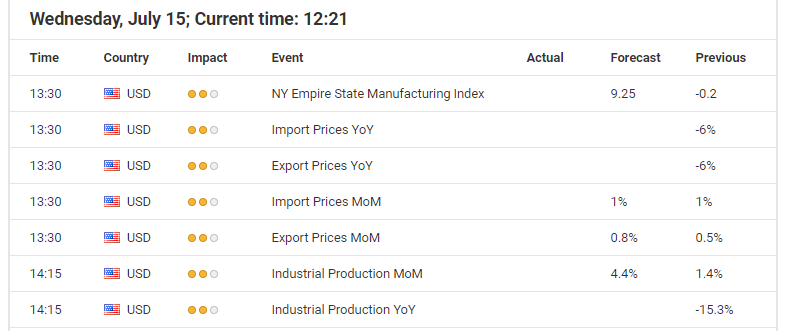
Economic events calendar

Source: Economic Events July 15, 2020 – Admiral Markets’ Forex Calendar

While Gold failed to gain renewed bullish momentum after the precious metal broke to new yearly highs. It closed above 1,800 USD for the first time since 2011, and the picture keeps on brightening.

While recent US economic data kept on being better than expected, resulting in the Citi Economic Surprise Index rising to a new all-time high and, to the delight of market participants, so US yields didn’t take on any new bullish momentum while Gold broke to new highs.

Last Friday, 10-year US Treasury yields opened below 0.60%, approaching its lowest all-time close of 0.545%.

That said, it seems as if current developments in Gold (and also Silver) are an anticipation of the potential negative impact on the US economy which will be countered with more fiscal stimulus by the US government, financed by freshly printed USD by the Fed.

So, disappointing US economic projections, like today’s industrial production printing below expectations, could result in US yields pushing towards its all-time low close at 0.545%, acting as a catalyst for the bulls and push the yellow metal above 1,820 USD.

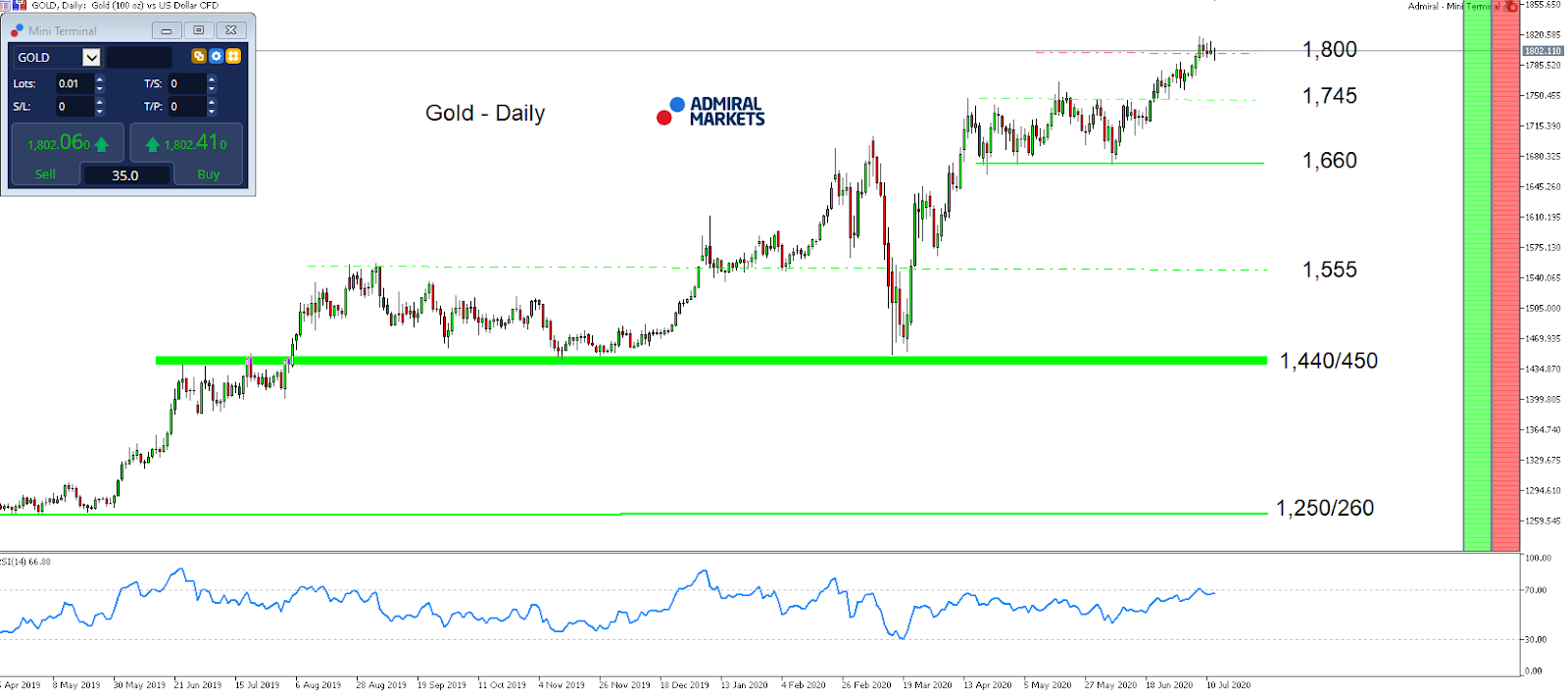
Such a break higher levels the path up to the current all-time high of around 1,920 USD, while technically the mode on a daily time-frame in Gold stays bullish as long as we trade above 1,660 USD:

Gold daily chart

Source: Admiral Markets MT5 with MT5-SE Add-on Gold Daily chart (between April 15, 2019, to July 14, 2020). Accessed: July 14, 2020, at 10:00pm GMT – Please note: Past performance is not a reliable indicator of future results, or future performance.

In 2015, the value of Gold fell by 10.4%, in 2016, it increased by 8.1%, in 2017, it increased by 13.1%, in 2018, it fell by 1.6%, in 2019, it increased by 18.9%, meaning that after five years, it was up by 28%.

Discover the world’s #1 multi-asset platform

Admiral Markets offers professional traders the ability to trade with a custom, upgraded version of MetaTrader 5, allowing you to experience trading at a significantly higher, more rewarding level. Experience benefits such as the addition of the Market Heat Map, so you can compare various currency pairs to see which ones might be lucrative investments, access real-time trading data, and so much more. Click the banner below to start your FREE download of MT5 Supreme Edition!

Download MetaTrader 5 and begin trading today!

Disclaimer: The given data provides additional information regarding all analysis, estimates, prognosis, forecasts or other similar assessments or information (hereinafter “Analysis”) published on the website of Admiral Markets. Before making any investment decisions please pay close attention to the following:

  1. This is a marketing communication. The analysis is published for informative purposes only and are in no way to be construed as investment advice or recommendation. It has not been prepared in accordance with legal requirements designed to promote the independence of investment research, and that it is not subject to any prohibition on dealing ahead of the dissemination of investment research.
  2. Any investment decision is made by each client alone whereas Admiral Markets shall not be responsible for any loss or damage arising from any such decision, whether or not based on the Analysis.
  3. Each of the Analysis is prepared by an independent analyst (Jens Klatt, Professional Trader and Analyst, hereinafter “Author”) based on the Author’s personal estimations.
  4. To ensure that the interests of the clients would be protected and objectivity of the Analysis would not be damaged Admiral Markets has established relevant internal procedures for prevention and management of conflicts of interest.
  5. Whilst every reasonable effort is taken to ensure that all sources of the Analysis are reliable and that all information is presented, as much as possible, in an understandable, timely, precise and complete manner, Admiral Markets does not guarantee the accuracy or completeness of any information contained within the Analysis. The presented figures refer that refer to any past performance is not a reliable indicator of future results.
  6. The contents of the Analysis should not be construed as an express or implied promise, guarantee or implication by Admiral Markets that the client shall profit from the strategies therein or that losses in connection therewith may or shall be limited.
  7. Any kind of previous or modeled performance of financial instruments indicated within the Publication should not be construed as an express or implied promise, guarantee or implication by Admiral Markets for any future performance. The value of the financial instrument may both increase and decrease and the preservation of the asset value is not guaranteed.
  8. The projections included in the Analysis may be subject to additional fees, taxes or other charges, depending on the subject of the Publication. The price list applicable to the services provided by Admiral Markets is publicly available from the website of Admiral Markets.

Leveraged products (including contracts for difference) are speculative in nature and may result in losses or profit. Before you start trading, you should make sure that you understand all the risks.

By Admiral Markets

Biases in algorithms hurt those looking for information on health

By Anjana Susarla, Michigan State University

YouTube hosts millions of videos related to health care.

The Health Information National Trends Survey reports that 75% of Americans go to the internet first when looking for information about health or medical topics. YouTube is one of the most popular online platforms, with billions of views every day, and has emerged as a significant source of health information.

Several public health agencies, such as state health departments, have invested resources in YouTube as a channel for health communication. Patients with chronic health conditions especially rely on social media, including YouTube videos, to learn more about how to manage their conditions.

But video recommendations on such sites could exacerbate preexisting disparities in health.

A significant fraction of the U.S. population is estimated to have limited health literacy, or the capacity to obtain, process and understand basic health information, such as the ability to read and comprehend prescription bottles, appointment slips or discharge instructions from health clinics.

Studies of health literacy, such as the National Assessment of Adult Literacy conducted in 2003, estimated that only 12% of adults had proficient health literacy skills. This has been corroborated in subsequent studies.

I’m a professor of information systems, and my own research has examined how social media platforms such as YouTube widen such health literacy disparities by steering users toward questionable content.

On YouTube

Extracting thousands of videos purporting to be about diabetes, I verified whether the information shown conforms to valid medical guidelines.

I found that the most popular and engaging videos are significantly less likely to have medically valid information.

Users typically encounter videos on health conditions through keyword searches on YouTube. YouTube then provides links to authenticated medical information, such as the top-ranked results. Several of these are produced by reputable health organizations.

[Deep knowledge, daily. Sign up for The Conversation’s newsletter.]

Recently, YouTube has adjusted how search results are displayed, allowing results to be ranked by “relevance” and providing links to verified medical information.

However, when I recruited physicians to watch the videos and rate them on whether these would be considered valid and understandable from a patient education perspective, they rated YouTube’s recommendations poorly.

I found that the most popular videos are the ones that tend to have easily understandable information but are not always medically valid. A study on the most popular videos on COVID-19 likewise found that a quarter of videos did not contain medically valid information.

While videos from sources like the CDC might be the most informative, they are not always the most popular.

The health literacy divide

This is because the algorithms underlying recommendations on social media platforms are biased toward engagement and popularity.

Based on how digital platforms provide information to search queries, a user with greater health literacy is more likely to discover usable medical advice from a reputed health care provider, such as the Mayo Clinic. The same algorithm will steer a less literate user toward fake cures or misleading medical advice.

This could be especially harmful for minority groups. Studies of health literacy in the United States have found that the impact of limited health literacy disproportionately impacts minorities.

We do not have enough studies on the state of health literacy among minority populations, especially in urban areas. That makes it challenging to design health communication aimed at minorities, and interventions to improve the utilization of existing health care resources.

There can also be cultural barriers regarding health care in minority populations that exacerbate the literacy barriers. Insufficient education and lack of self-management of chronic care have also been highlighted as challenges for minorities.

Algorithmic biases

Correcting algorithmic biases and providing better information to users of technology platforms would go a long way in promoting equity.

For example, a pioneering study by the Gender Shades project examined disparities in identifying gender and skin type across different companies that provide commercial facial recognition software. It concluded that companies were able to make progress in reducing these disparities once issues were pointed out.

According to some estimates, Google receives over a billion health questions everyday. Especially those with low health literacy have a substantial risk of encountering medically unsubstantiated information, such as popular myths or active conspiracy theories that are not based on scientific evidence.

The World Economic Forum has dubbed health-related misinformation an “infodemic.” Digital platforms where anyone can engage also make them vulnerable to misinformation, accentuating disparities in health literacy, as my own work shows.

Social media and search companies have partnered with health organizations such as the Mayo Clinic to provide validated information and reduce the spread of misinformation. To make health information on YouTube more equitable, those who design recommendation algorithms would have to incorporate feedback from clinicians and patients as well as end users.The Conversation

About the Author:

Anjana Susarla, Professor of Information Systems, Michigan State University

This article is republished from The Conversation under a Creative Commons license. Read the original article.


Carbon pricing works: the largest-ever study puts it beyond doubt

By Paul Burke, Crawford School of Public Policy, Australian National University; Frank Jotzo, Australian National University, and Rohan Best, Macquarie University 

– Putting a price on carbon should reduce emissions, because it makes dirty production processes more expensive than clean ones, right?

That’s the economic theory. Stated baldly, it’s obvious, but there is perhaps a tiny chance that what happens in practice might be something else.

In a newly-published paper, we set out the results of the largest-ever study of what happens to emissions from fuel combustion when they attract a charge.

We analysed data for 142 countries over more than two decades, 43 of which had a carbon price of some form by the end of the study period.

The results show that countries with carbon prices on average have annual carbon dioxide emissions growth rates that are about two percentage points lower than countries without a carbon price, after taking many other factors into account.

By way of context, the average annual emissions growth rate for the 142 countries was about 2% per year.

This size of effect adds up to very large differences over time. It is often enough to make the difference between a country having a rising or a declining emissions trajectory.

Emissions tend to fall in countries with carbon prices

A quick look at the data gives a first clue.

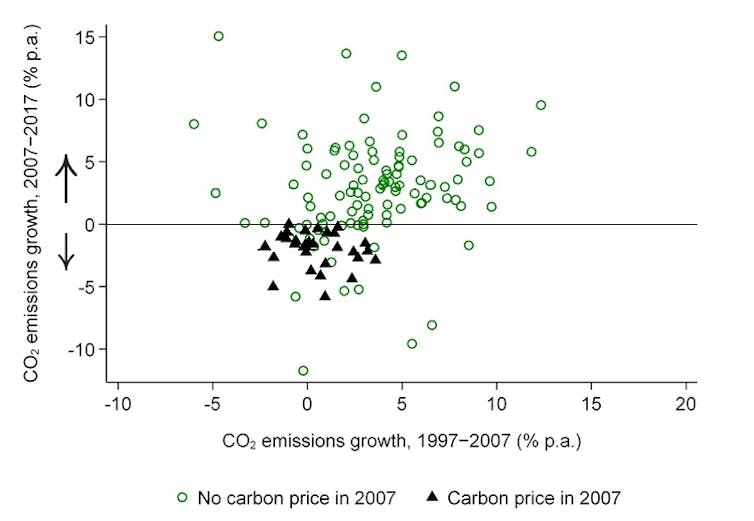
The figure below shows countries that had a carbon price in 2007 as a black triangle, and countries that did not as a green circle.

On average, carbon dioxide emissions fell by 2% per year over 2007–2017 in countries with a carbon price in 2007 and increased by 3% per year in the others.


Carbon dioxide emissions growth in countries with and without a carbon price in 2007

Emissions are from fuel combustion and include road-sector emissions.
Best, Burke, Jotzo 2020

The difference between an increase of 3% per year and a decrease of 2% per year is five percentage points. Our study finds that about two percentage points of that are due to the carbon price, with the remainder due to other factors.

The challenge was pinning down the extent to which the change was due to the implementation of a carbon price and the extent to which it was due to a raft of other things happening at the same time, including improving technologies, population and economic growth, economic shocks, measures to support renewables and differences in fuel tax rates.

We controlled for a long list of other factors, including the use of other policy instruments.

It would be reasonable to expect a higher carbon price to have bigger effects, and this is indeed what we found.

On average an extra euro per tonne of carbon dioxide price is associated with a lowering in the annual emissions growth rate in the sectors it covers of about 0.3 percentage points.

Lessons for Australia

The message to governments is that carbon pricing almost certainly works, and typically to great effect.

While a well-designed approach to reducing emissions would include other complementary policies such as regulations in some sectors and support for low-carbon research and development, carbon pricing should ideally be the centrepiece of the effort.

Unfortunately, the politics of carbon pricing have been highly poisoned in Australia, despite it being popular in a number of countries with conservative governments including Britain and Germany. Even Australia’s Labor opposition seems to have given up.

Nevertheless, it should be remembered that Australia’s two-year experiment with carbon pricing delivered emissions reductions as the economy grew. It was working as designed.

Groups such as the Business Council of Australia that welcomed the abolition of the carbon price back in 2014 are now calling for an effective climate policy with a price signal at its heart.

Carbon pricing elsewhere

The results of our study are highly relevant to many governments, especially those in industrialising and developing countries, that are weighing up their options.

The world’s top economics organisations including the International Monetary Fund, the World Bank and the Organisation for Economic Co-operation and Development continue to call for expanded use of carbon pricing.

If countries are keen on a low-carbon development model, the evidence suggests that putting an appropriate price on carbon is a very effective way of achieving it.


An open-access version of this research is available here.The Conversation

About the Author:

Paul Burke, Associate Professor, Crawford School of Public Policy, Australian National University; Frank Jotzo, Director, Centre for Climate and Energy Policy, Australian National University, and Rohan Best, Lecturer in Economics, Macquarie University

This article is republished from The Conversation under a Creative Commons license. Read the original article.


Inconvenient truths about US debt explosion

By Dan Steinbock

 – The resurgence of COVID-19 in the United States is paving the way to a debt record, even relative to government debt at the end of World War II. The collateral damage in global recovery will be significant.

The delays and containment failures of the COVID-19 in major advanced economies, particularly the United States, are morphing into a faster-than-expected series of economic challenges, including debt crises.

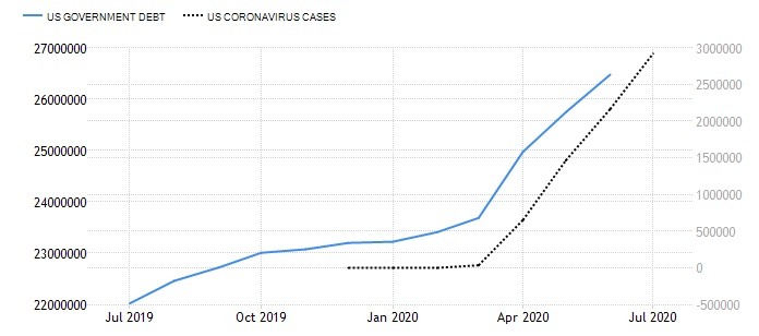
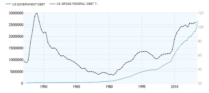
Only two quarters ago, US federal debt hovered around $23 trillion; a stunning 106% as percentage of the GDP. Today – after barely two quarters – that debt is close to $27 trillion (Figure 1). Moreover, as US GDP has drastically contracted, the debt-to-GDP ratio is now closer to 133%; higher than that of Italy in 2018, or Greece prior to its debt crisis in 2010.

But unlike Italy or Greece, US is one of the global anchor economies. Consequently, spillover effects will ensue. Furthermore, both US government debt and the debt-to-GDP ratio will continue to climb.

Figure 1 US Government Debt and US Coronavirus cases

Failures in COVID-19 containment translates to…

In early spring, the epicenter of the COVID-19 moved to Western Europe. Then, it exploded in North America. Today, it is rapidly spreading in emerging and developing economies, while accelerating in the United States, again.

The spread in poorer economies was widely expected; the resurgence in the US was a concern, but mainly in late fall 2020 or early spring 2021. Now it is a reality.

The reasons are well known: Despite knowledge about the new coronavirus already on January 3, the Trump administration did not mobilize against it. When the WHO launched its international alert on January 30, that did not result in effective mobilization either. After the WHO finally issued the pandemic alert, the Trump White House began mobilization, but belatedly and ineffectively.

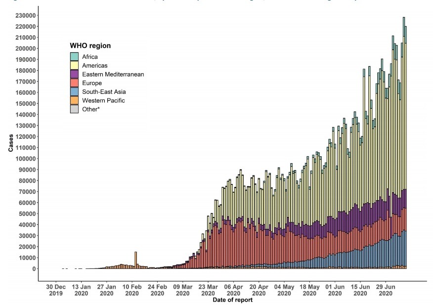
Due to poor crisis leadership and premature exits, the administration is now struggling with the COVID-19 resurgence, while similar failures and spillovers have turned the Americas into the largest regional COVID-19 epicenter (Figure).

Figure 2 Confirmed COVID-19 Cases by Regions, through July 11, 2020

Source: WHO

There was nothing inevitable about this trajectory. In January, first virus cases surfaced in both the US and Canada. The former delayed an effective response; the latter mobilized more effectively. By mid-July, US will have close to 3.5 million cases and almost 140,000 deaths; in Canada, the comparable figures are likely to remain lower than 110,000 and below 9,000, respectively.

Due to the central role of the US in the global economy, the pandemic failure will severely compound collateral economic damage – including the coming debt crises.

Federal debt surpassing WWII record

In the past two quarters, the early economic defense has been by the major central banks to cut down the rates, inject liquidity and re-start major asset purchases. Moreover, a rare bipartisan consensus allowed the Congress to pass the $3 trillion stimulus to avoid a more severe collapse in the spring. But another package will be needed later in the summer.

Once again, major advanced economies are hoarding new debt to defuse short-term economic challenges, which will drastically worsen their longer-term debt challenges.

Following the 2008 contraction, US debt-ceiling crisis climaxed in fall 2011. That’s when federal debt was still $14 trillion; now it has almost doubled (!) to $27 trillion.

At the end of World War II, US federal debt-to-GDP ratio was almost 120%. Thanks to the secular growth potential in the US and global recovery, it was reduced relatively fast. Today US debt-to-GDP ratio – if real-time data were to be included – has likely surpassed the wartime record, but in peacetime conditions (Figure).

Figure 3 US Federal Debt surpasses WWII record

US economy was in secular stagnation already before the coronavirus contraction. Consequently, it lacks long-term growth potential to reduce that debt. Moreover, the volume of federal debt will continue to climb, and so will the debt-to-GDP ratio.

What are some of the effective implications?

The great coronavirus contraction just got worse

Only a few weeks ago, I projected US second-quarter decline to be a historical -33%. Now, thanks to the COVID-19 resurgence, that contraction could be closer to -53%.

Prior to the COVID-19 resurgence, many observers hoped that US economy had bottomed out in May, which would have kept the full-year contraction at about 5.0%. That’s no longer in the cards. In reality, the plunge could amount to -8% to -9%.

Thanks to the pandemic resurgence, US recovery is likely to prove slower than anticipated. Not only will the recovery linger, it is likely to prove more fragile than anticipated, due to concerns for new COVID-19 waves in the fall and uncertainty about when an effective vaccine, therapies, or both will be available.

Those who hoped US unemployment would remain below 8% may be frustrated. The lingering recovery may keep unemployment rate close to 9% at the year-end, and it may not return to pre-crisis levels until the end of 2023; if even then. In a downside scenario, it would remain closer to 10% in 2020 and improve more slowly.

Despite the jobs liftoff in May, some 20 million jobs have been lost since the pandemic. Many of those jobs may be gone. And since small businesses, which have benefited from the new PPP (Paycheck Protection Program) loans, are obligated to rehire only 60% of their pre-crisis workforce, adequate incentives for full employment are missing.

Thanks to the misguided trade wars plus the coronavirus contraction, trade volumes have collapsed. In turn, a new flare-up of trade tensions – since President Trump has now ruled out a Phase 2 truce – will suppress private investment. That, in turn, will penalize business and residential investment severely

Yet, there was nothing inevitable in the current trajectory that heralds a historical debt crisis in America. It was paved with policy mistakes and unipolar arrogance. It could be corrected with right policies and multilateral cooperation.

Misaligned with all economic realities of ordinary Americans, the White House’s ideological blindness is the fastest way to a historical failure.

About the Author:

Dr. Dan Steinbock is an internationally recognized strategist of the multipolar world and the founder of Difference Group. He has served at the India, China and America Institute (USA), Shanghai Institutes for International Studies (China) and the EU Center (Singapore). For more, see https://www.differencegroup.net

Based on Dr Steinbock’s briefing on July 10, 2020


Japanese Candlesticks Analysis 14.07.2020 (EURUSD, USDJPY, EURGBP)

Article By RoboForex.com

EURUSD, “Euro vs. US Dollar”

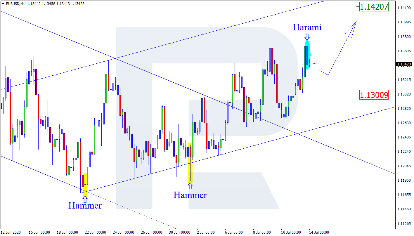
As we can see in the H4 chart, the pair is still forming the ascending channel. After forming a Harami pattern, EURUSD is reversing. Considering the current bullish dynamics, the price may finish the correction and then resume trading upwards to reach the resistance level at 1.1420. At the same time, an alternative scenario implies that the instrument may continue falling to return to 1.1300.

EURUSD
Risk Warning: the result of previous trading operations do not guarantee the same results in the future

USDJPY, “US Dollar vs. Japanese Yen”

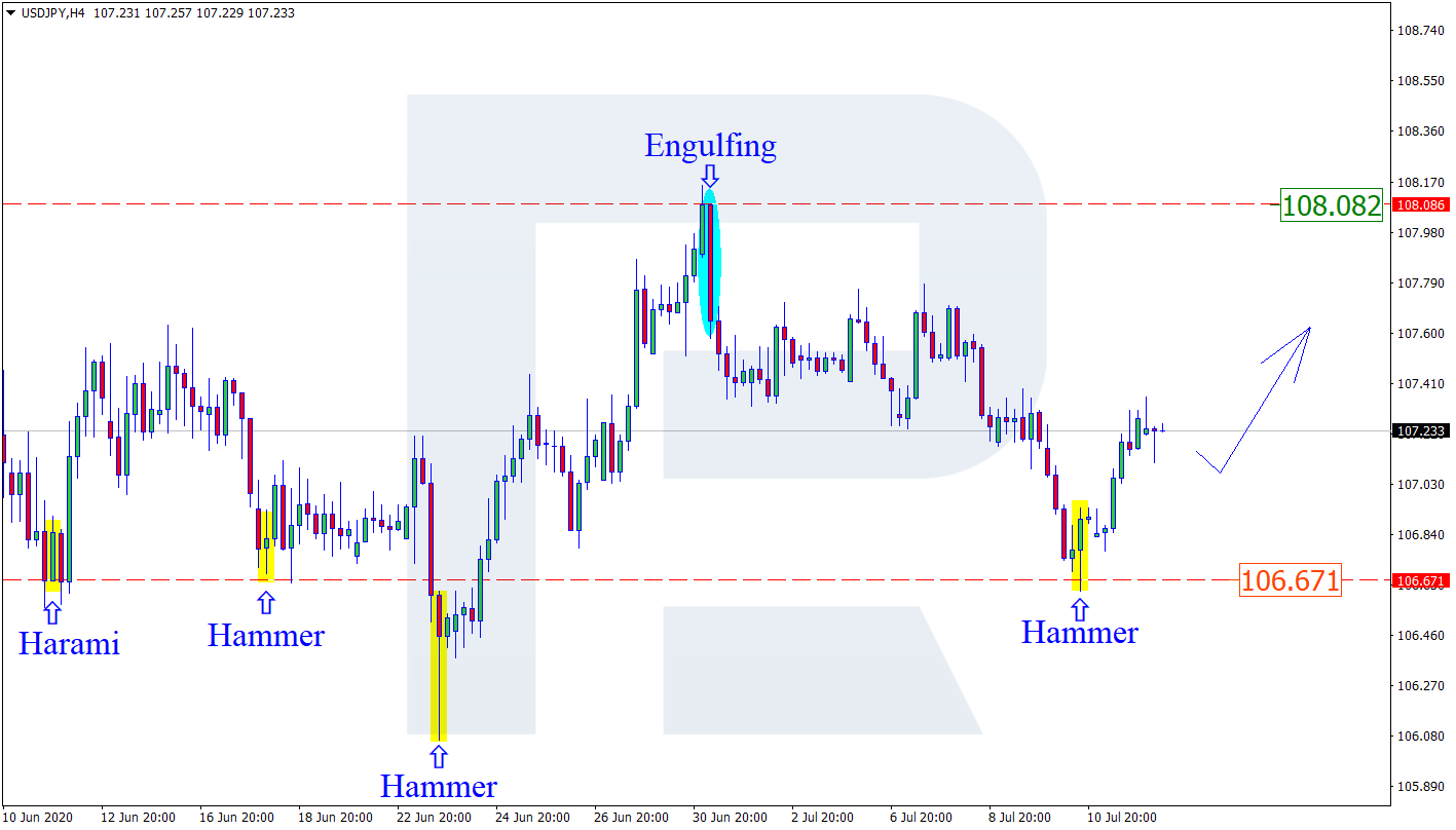
As we can see in the H4 chart, after forming a Hammer pattern not far from the support area, USDJPY has started reversing. At the moment, the pair is moving upwards. The current situation implies that after a slight correction the market may resume the ascending tendency towards the resistance level at 108.08. Still, there is an opposite scenario, which says that the instrument may fall and return to 106.67.

USDJPY
Risk Warning: the result of previous trading operations do not guarantee the same results in the future

EURGBP, “Euro vs. Great Britain Pound”

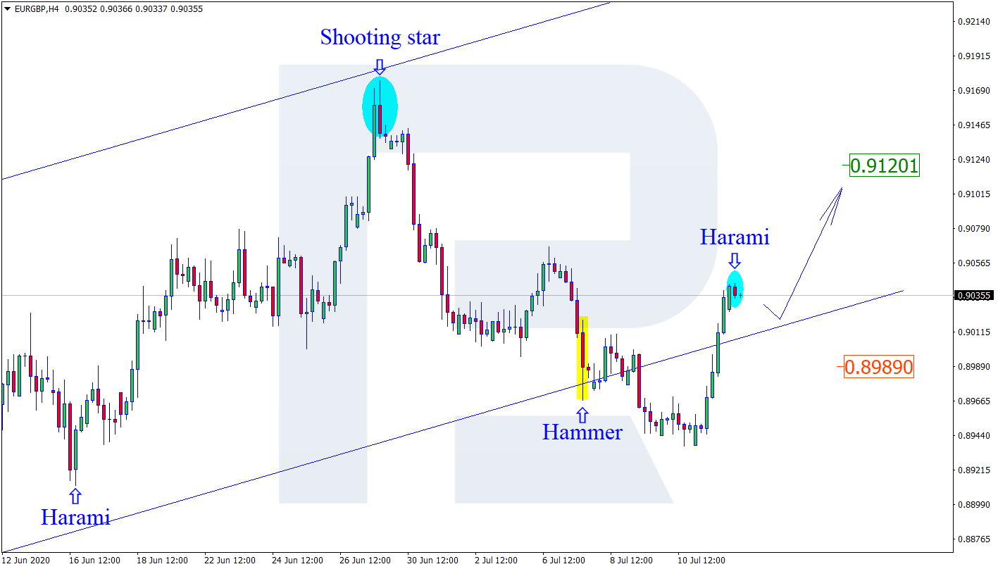
As we can see in the H4 chart, the pair is moving inside the rising channel again. By now, EURGBP has completed a Harami pattern, which may signal a new correction. After the correction, the price may resume moving to reach its upside target at 0.9120. In the future, the instrument may continue trading upwards to update the highs. However, there might be another scenario, according to which the asset may correct towards the support level at 0.8989.

EURGBP

Article By RoboForex.com

Attention!
Forecasts presented in this section only reflect the author’s private opinion and should not be considered as guidance for trading. RoboForex LP bears no responsibility for trading results based on trading recommendations described in these analytical reviews.

Ichimoku Cloud Analysis 14.07.2020 (EURGBP, BTCUSD, GBPUSD)

Article By RoboForex.com

EURGBP, “Euro vs Great Britain Pound”

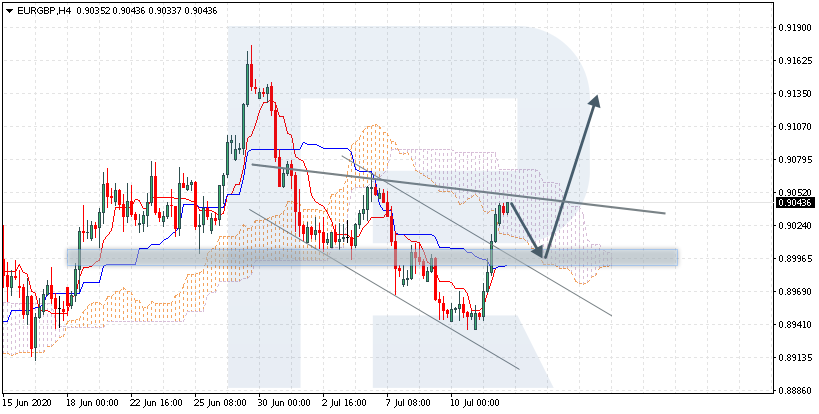
EURGBP is trading at 0.9043; the instrument is moving inside Ichimoku Cloud, thus indicating a sideways tendency. The markets could indicate that the price may test the cloud’s downside border at 0.8995 and then resume moving upwards to reach 0.9135. Another signal in favor of further uptrend will be a rebound from the descending channel’s upside border. However, the bullish scenario may be canceled if the price breaks the cloud’s downside border and fixes below 0.8955. In this case, the pair may continue falling towards 0.8905. To confirm further growth, the asset must break the cloud’s upside border and fix above 0.9080, thus indicating a completion of a Head & Shoulders reversal pattern.

EURGBP
Risk Warning: the result of previous trading operations do not guarantee the same results in the future

BTCUSD, “Bitcoin vs US Dollar”

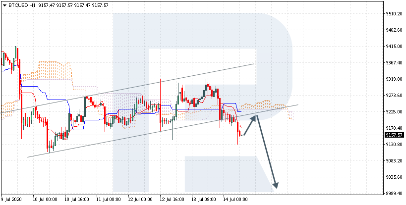
BTCUSD is trading at 9157.00; the instrument is moving below Ichimoku Cloud, thus indicating a descending tendency. The markets could indicate that the price may test Tenkan-Sen and Kijun-Sen at 9205.00 and then resume moving downwards to reach 8905.00. Another signal in favor of further downtrend will be a rebound from the rising channel’s downside border. However, the bearish scenario may no longer be valid if the price breaks the cloud’s upside border and fixes above 9325.00. In this case, the pair may continue growing towards 9645.00.

BTCUSD
Risk Warning: the result of previous trading operations do not guarantee the same results in the future

GBPUSD, “Great Britain Pound vs US Dollar”

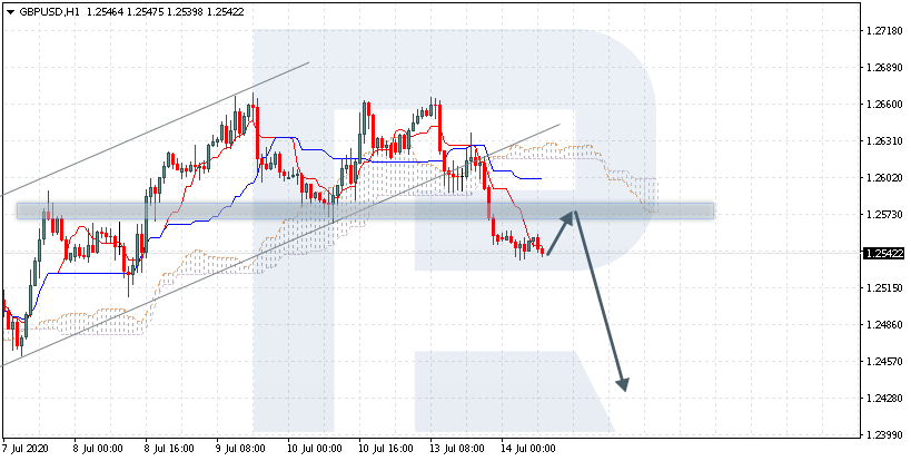
GBPUSD is trading at 1.2542; the instrument is moving below Ichimoku Cloud, thus indicating a descending tendency. The markets could indicate that the price may test Tenkan-Sen and Kijun-Sen at 1.2575 and then resume moving downwards to reach 1.2430. Another signal in favor of further downtrend will be a rebound from the downside border of a Double Top reversal pattern. However, the bearish scenario may no longer be valid if the price breaks the cloud’s upside border and fixes above 1.2640. In this case, the pair may continue growing towards 1.2730.

GBPUSD

Article By RoboForex.com

Attention!
Forecasts presented in this section only reflect the author’s private opinion and should not be considered as guidance for trading. RoboForex LP bears no responsibility for trading results based on trading recommendations described in these analytical reviews.

The Analytical Overview of the Main Currency Pairs on 2020.07.14

by JustForex

The EUR/USD currency pair

Technical indicators of the currency pair:
  • Prev Open: 1.13023
  • Open: 1.13416
  • % chg. over the last day: +0.29
  • Day’s range: 1.13253 – 1.13503
  • 52 wk range: 1.0777  – 1.1494

The technical pattern is still ambiguous on the EUR/USD currency pair. A trading instrument is consolidating. Investors expect additional drivers. The second wave of the COVID-19 epidemic remains in the spotlight. Governor of California, Gavin Newsom, imposed new statewide restrictions due to a sharp increase in the number of people infected with coronavirus. At the moment, the key range is 1.1325-1.1370. We expect important economic releases from Germany and the US. Positions should be opened from key levels.

The news feed on 2020.07.14:
  • – German ZEW economic sentiment index at 12:00 (GMT+3:00);
  • – US inflation report at 15:30 (GMT+3:00).
EUR/USD

Indicators do not give accurate signals: the price is testing 50 MA.

The MACD histogram is in the positive zone, but below the signal line, which gives a weak signal to buy EUR/USD.

Stochastic Oscillator is in the neutral zone, the %K line has crossed the %D line. There are no signals at the moment.

Trading recommendations
  • Support levels: 1.1325, 1.1300, 1.1260
  • Resistance levels: 1.1370, 1.1400

If the price fixes below 1.1325, EUR/USD quotes are expected to fall. The movement is tending to 1.1300-1.1270.

An alternative could be the growth of the EUR/USD currency pair to 1.1400-1.1420.

The GBP/USD currency pair

Technical indicators of the currency pair:
  • Prev Open: 1.26203
  • Open: 1.25539
  • % chg. over the last day: -0.57
  • Day’s range: 1.25063 – 1.25609
  • 52 wk range: 1.1466  – 1.3516

GBP/USD quotes have been declining. During yesterday’s and today’s trading sessions, the British pound has lost more than 100 points against the greenback. At the moment, the GBP/USD currency pair is testing the support level of 1.2510. The 1.2555 mark is the nearest resistance. A trading instrument has the potential for further decline. Great Britain published a weak report on the country’s GDP. Positions should be opened from key levels.

We recommend paying attention to economic releases from the US.

GBP/USD

Indicators signal the power of sellers: the price has fixed below 100 MA.

The MACD histogram is in the negative zone, indicating the bearish sentiment.

Stochastic Oscillator is in the neutral zone, the %K line has started crossing the %D line. There are no signals at the moment.

Trading recommendations
  • Support levels: 1.2510, 1.2470, 1.2440
  • Resistance levels: 1.2555, 1.2580, 1.2620

If the price fixes below 1.2510, a further fall in GBP/USD quotes is expected. The movement is tending to 1.2470-1.2440.

An alternative could be the growth of the GBP/USD currency pair to 1.2580-1.2620.

The USD/CAD currency pair

Technical indicators of the currency pair:
  • Prev Open: 1.35851
  • Open: 1.36079
  • % chg. over the last day: +0.08
  • Day’s range: 1.35931 – 1.36463
  • 52 wk range: 1.2949  – 1.4668

Purchases prevail on the USD/CAD currency pair. The trading instrument has updated local highs. USD/CAD quotes found resistance at 1.3645. The 1.3610 mark is already a “mirror” support. The continuation of the upward trend is possible. We recommend paying attention to the dynamics of “black gold” prices. Positions should be opened from key levels.

The news feed on Canada’s economy is calm.

USD/CAD

Indicators signal the power of buyers: the price has fixed above 50 MA and 100 MA.

The MACD histogram is in the positive zone, indicating the bullish sentiment.

Stochastic Oscillator is in the neutral zone, the %K line has crossed the %D line. There are no signals at the moment.

Trading recommendations
  • Support levels: 1.3610, 1.3580, 1.3545
  • Resistance levels: 1.3645, 1.3700

If the price fixes above 1.3645, further growth of the USD/CAD quotes is expected. The movement is tending to the round level of 1.3700.

An alternative could be a decrease in the USD/CAD currency pair to 1.3585-1.3560.

The USD/JPY currency pair

Technical indicators of the currency pair:
  • Prev Open: 106.884
  • Open: 107.238
  • % chg. over the last day: +0.34
  • Day’s range: 107.116 – 107.366
  • 52 wk range: 101.19  – 112.41

USD/JPY quotes have been growing. The trading instrument has updated local highs. At the moment, the USD/JPY currency pair is testing the following support and resistance levels: 107.10 and 107.35, respectively. The technical pattern signals a further increase in USD/JPY quotes. We recommend payштп attention to the dynamics of US government bonds yield. Positions should be opened from key levels.

The news feed on Japan’s economy is calm.

USD/JPY

Indicators do not give accurate signals: the price has crossed 100 MA.

The MACD histogram is in the positive zone, indicating the bullish sentiment.

Stochastic Oscillator is in the overbought zone, the %K line has crossed the %D line. There are no signals at the moment.

Trading recommendations
  • Support levels: 107.10, 106.95, 106.80
  • Resistance levels: 107.35, 107.60, 107.75

If the price fixes above 107.35, further growth of the USD/JPY quotes is expected. The movement is tending to 107.60-107.80.

An alternative could be a decrease in the USD/JPY currency pair to 106.90-106.70.

by JustForex

Gold & Silver Measured Moves

By TheTechnicalTraders 

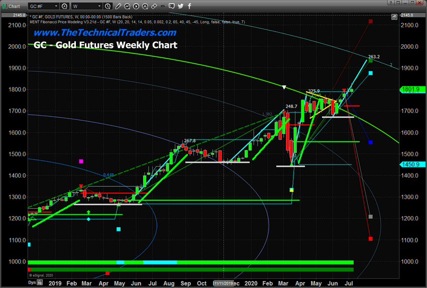
– The next few weeks are certain to attract much attention to precious metals.  Hardly anyone can argue that Gold has not experienced an incredible upside price rally over the last 12+ months.  Recently, Gold closed above $1800 for the first time since 2011.  Our researchers believe the next target is $1935.  Keep reading to learn why we believe this is the next major price target for Gold.

Gold Weekly Price Analysis

Over the past 18+ months, Gold continues to develop price patterns that seem to be replicating going forward.  This pattern consists of an advance in price followed by consolidation/rotation in price to set up a new momentum base.  The example of this price advance from May 2019 to August 2019 consisted of a $267 upside price advance (just over 20%).  Subsequent advances were similar in size. November 2019 to March 2020 advance rose $248.  March 2020 to April 2020 advance rose $325.

Our research team believes the current momentum base, near $1725, will prompt a rally in Gold that will target $1935 in a similar type of price advance.  After that level is reached, a new momentum bottom will likely setup near $1900 which will be followed by another upside price advance.  This time targeting $2150 to $2190.  We believe once Gold clears the $2100 level, global investors will identify the rally more efficiently and the upside parabolic price move may extend very rapidly.

Silver Weekly Price Analysis

With Silver, the measured moves are averaging about $5.25 to $5.40 with each advance.  If this continues from the current momentum base level near $17.50, then the next upside price target level should be near $23.00 in Silver.  Beyond that, the subsequent target level should be near $28.00.

Before you continue, be sure to opt-in to our free market trend signals 
before closing this page, so you don’t miss our next special report!

This would represent a massive upside price advance in Silver of nearly 59%.  Ultimately, the upside move in metals illustrates a strong level of fear in the markets related to global market stability and solvency.  Silver has recently begun a move above the $19.00 price level and once it clears the $21 level, the next upside price advance should be fairly quick.

We believe the early Q2 2020 earnings data may shock the markets and cause the metals markets to rally.  Initially, though, the metals may move a bit lower as the markets contract from the shock.  This should be short-lived as metals have already rallied to a point where investors know the fear of the shock should act to propel metals above recent momentum base levels.

Watch how Silver moves compared to Gold.  Silver has already started to move more aggressively higher than Gold.  Once the real parabolic move begins, Silver will begin to skyrocket much higher than Gold on a percentage basis.  We should know how the metals will react to the economic data fairly quickly.  If you have not already hedged your portfolio into precious metals or miners, we suggest establishing a 15% to 25% protective hedge at this time.

Get our Active ETF Swing Trade Signals or if you have any type of retirement account and are looking for signals when to own equities, bonds, or cash, be sure to become a member of my Passive Long-Term ETF Investing Signals which we are about to issue a new signal for subscribers.

Chris Vermeulen
Chief Market Strategies
Founder of Technical Traders Ltd.

NOTICE: Our free research does not constitute a trade recommendation or solicitation for our readers to take any action regarding this research.  It is provided for educational purposes only.  Our research team produces these research articles to share information with our followers/readers in an effort to try to keep you well informed.

TheTechnicalTraders.com