By Money Metals News Service
As the Mainstream financial media continues to promote the biggest market bubble in history, only a small fraction of investors are prepared for the disaster when it finally POPS. The markets are so insane today, it seems as if fundamentals don’t matter any more. However, they actually do if we look at the numbers closely.
In order to invest in the correct assets going forward, one must choose between those with a low RISK and high REWARD versus assets with a high RISK and low REWARD. While this may seem like common sense, I can assure you, the market makes no sense whatsoever today. And most investors are doing quite the opposite. Go figure.
If we look at the following charts in this article, we can clearly see which of the following assets, the DOW JONES, GOLD or SILVER, enjoy the lowest risk and highest reward.
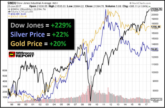
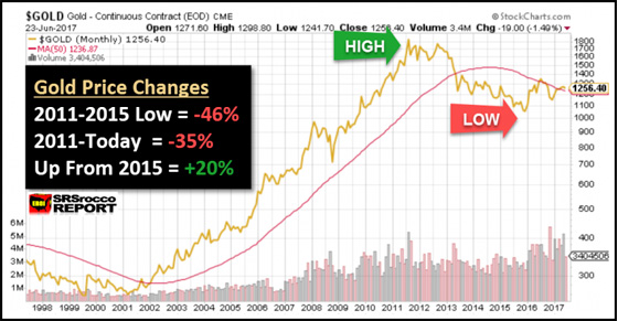
This chart shows the price action of the Dow Jones Index, gold and silver. Since its low in 2009, the Dow Jones Index is up 229%, from 6,500 to 21,400 currently. Even though the Dow Jones Index experienced a brief 17% correction in 2011, it hasn’t endured a healthy 30-50% market correction in over eight years. It is most certainly overdue. However, after the precious metals prices peaked in 2011 and then declined, silver is only up 22% from its low in 2015 and gold is up 20%. Thus, the Dow Jones Index has surged higher for eight straight years, while gold and silver are still down considerably from their peak prices in 2011. If we look at each asset class separately, we can see how over-valued the Dow Jones Index is compared to gold and silver. The next chart shows that the gold price fell 46% from its peak in 2011 to its low in 2015. Now, even considering the 20% current rise in the gold price from its low in 2015, it is still 35% below its 2011 peak:
Looking at the silver chart, its price movement is much more volatile than gold. The silver price fell a whopping 73% from its peak in 2011 to its low at the end of 2015. Currently, the silver price is still 66% below its 2011 high:
Free Reports:
 Get Our Free Metatrader 4 Indicators - Put Our Free MetaTrader 4 Custom Indicators on your charts when you join our Weekly Newsletter
 Get our Weekly Commitment of Traders Reports - See where the biggest traders (Hedge Funds and Commercial Hedgers) are positioned in the futures markets on a weekly basis.
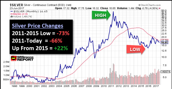
As I already mentioned, the silver price is only 22% up from its low in 2015. Now, let’s look at the Dow Jones Index:
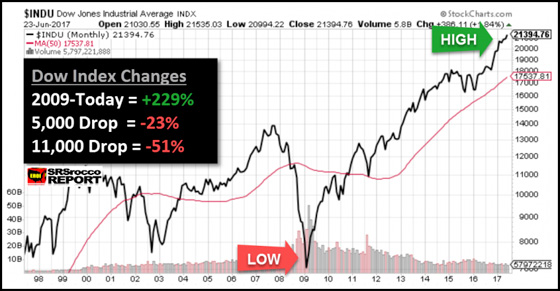
While the precious metals have experienced a healthy correction since 2011, the Dow Jones Index continues higher towards the heavens. It is up a stunning 229% from its low in 2009. If the Dow Jones Index fell 5,000 points, that would only be a 23% correction. However, if it fell 11,000 points, down to 10,400, it would have fallen 51%, less than its 54% market correction decline from 2007 to 2009. To get an idea of how overvalued the Dow Jones Index is, I am going to use the S&P 500 Index as an example. Why? Because the S&P 500 Index is up just about the same percentage as the Dow Jones Index since the low in 2009:
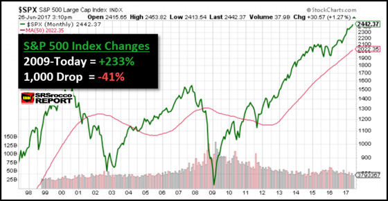
You will notice that the Dow Jones and S&P 500 charts are nearly identical. So, what happens to one, will happen to the other. To determine the fair value of the S&P 500, we look at the Schiller PE Ratio. Basically, the Schiller PE Ratio (PE = Price to earnings ratio) is defined as the price (Index price) divided by the average ten years of earnings…. adjusted for inflation.
This historical Schiller PE Ratio mean is 16.8. That means S&P 500 price is 16.8 times the average ten years worth of earnings. So, if the Schiller PE Ratio has averaged around 16.8 in its history, what is the ratio today?
According to Gurufocus.com, the present Schiller PE Ratio is 30.2, or nearly 80% higher than the mean. Not only is the current Schiller PE Ratio in bubble territory, it is even higher than the 27.4 ratio the last time it peaked in 2007. Well, we all know what happened in 2008 and 2009. During the first quarter of 2009, the Schiller PE Ratio fell to a low of 13.1.
Furthermore, before the stock market crash of 1929 and the ensuing Great Depression, the Schiller PE Ratio reached a high of 32.4 in September 1929….. only a few points higher than it is today.
So, what does that mean? It means that the Dow Jones and S&P 500 Indexes are now in record bubble territory and their future reward is LOW while their future risk is quite HIGH. However, if we look at gold and silver, we see quite the opposite.
Not only did the gold and silver prices experience a huge correction from 2011 to 2015, the current price of silver is very close to the cost of production. Here is a chart of one of the largest primary silver mining companies in the world…. Pan American Silver:
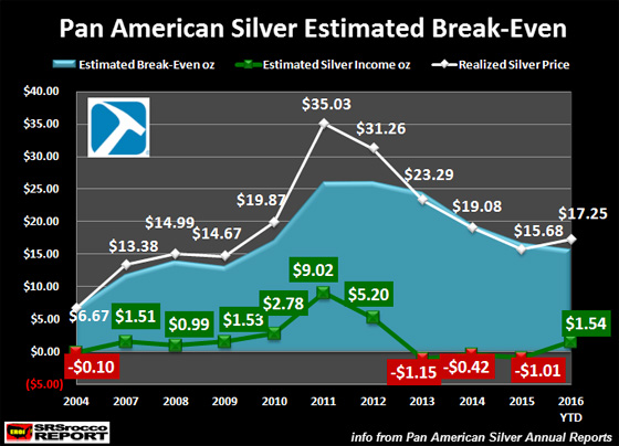
This chart shows Pan American Silver’s estimated profit-loss per ounce (GREEN LINE), versus the average spot price (WHITE LINE). As we can see in 2011, Pan American Silver made a $9.02 profit for each ounce of silver it produced when the average spot price reached $35.03. However, as the price declined over the next five years, Pan American Silver lost money in 2013, 2014 and 2015.
Even though Pan American Silver made an estimated $1.54 for each ounce of silver it produced 2016 YTD (last time I did the figures), it fell to about $1.00 and ounce during the first quarter of 2017. With the average spot price of silver at $17.42 Q1 2017, my rough estimate is that Pan American Silver needs abut $16.40 +/- to breakeven. With the current price of silver at $16.50, Pan American Silver isn’t making much money.
Moreover, my estimation for the average break-even for the primary silver mining industry is between $15-$17 an ounce. I have not done any recent calculations for the estimated breakeven for gold, but it looks to be between $1,100-$1,500. While the gold price has a bit more cushion than silver, we can plainly see that both gold and silver are much closer to a bottom than the Dow Jones Index.
According to this analysis, the HIGH RISK, LOW REWARD easily goes to the Dow Jones and S&P 500 Index, while the LOW RISK and HIGH REWARD belong to gold and silver.
We must remember, when the Dow Jones Index suffered a mere 2,000 point correction at the beginning of 2016, the gold and silver price surged:
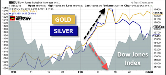
If the gold and silver price jumped 15% when the Dow Jones only fell 2,000 points in 2016… how high will their prices move when the Dow Index falls 5,000-10,000 points and suffers a 25-50% correction? Because the entire market is held up by so much leverage and debt, I do believe the precious metals will enter into a new market of much higher prices.
Lastly, even though the Cryptocurrencies are getting hammered today, this is just an overdue correction. Bitcoin and the other cryptocurrencies probably have a great deal more to fall before bottoming. However, I do see some of the top cryptocurrencies to hit new highs in the future. I mentioned this market because the same thing will happen to gold and silver.
All of a sudden one day and out of the blue, the price of gold and silver are going to surge higher. Then the next day… they will have jumped even higher still. Before investors or the public realizes it, the gold and silver prices will seem like they are too expensive to buy at this point….the same way when the cryptocurrencies shut up 200-1,500% in just brief period of time.
This is why an investor CANNOT TRY TO TIME WHEN TO GET INTO THE PRECIOUS METALS. If one does not have a decent amount of physical gold and silver, it will be extremely difficult or likely impossible to acquire the metals when the prices have skyrocketed. Sure, you might be able to get some metal, but the prices or premiums could be very high indeed.
So… as the folks who purchased Bitcoin and sat on them for several years before the huge move higher, the same thing will happen to gold and silver. While retail gold and silver sales have fallen significantly, as well as precious metals sentiment, the fundamentals point to a LOW RISK and HIGH REWARD… if we are patient.
 The Money Metals News Service provides market news and crisp commentary for investors following the precious metals markets.