Central Bank News Link List – Apr 22, 2014 – ECB Coeure: Still room to lower key rates: press

By CentralBankNews.info

Here’s today’s Central Bank News’ link list, click through if you missed the previous link list. The list comprises news about central banks that is not covered by Central Bank News. The list is updated during the day with the latest developments so readers don’t miss any important news.

          http://ift.tt/1iP0FNb

Volatility Ahead; Aussie Tops Against The Kiwi

Technical Sentiment: Bearish

Key Takeaways
• AUD/NZD remains capped at 1.0909 ahead of RBNZ this week;
• A break above the resistance is required for the long term uptrend to be validated;
• A pull back below 1.0830 and lower favors the Kiwi.

The last two months has seen Aussie rally higher against the Kiwi, from 1.0535 to 1.0909, pushing for a reversal of the long term downtrend. With a higher swing low in March, the trend will switch to bullish if AUD/NZD completes a higher swing high above 1.0909 – 1.0941. The strategic consolidation ahead of RBZN this week – with expectations that interest rates will be increased from 2.75% to 3.00% – will shape the landscape for weeks to come, depending on which direction the pair finally breaks.

Technical Analysis

AUDNZD Daily

As traders are anxiously waiting for the Reserve Bank of New Zealand’s interest decision on Wednesday, Aussie bulls met strong opposition for the third time since last week when reaching 1.0909. This resistance line was also respected back in December 2013 and February 2014; with 38.2% Fibonacci Retracement level (from 1.1576 down to 1.0488) further increasing the resistance confluence.

With a higher swing high in March, AUD/NZD appeared set to break the long term downtrend and establish a higher high above 1.0909 – 1.0941, towards 1.1078 – the 200-Day Moving Average on the Daily chart. The bullish scenario will be placed on hold if AUD/NZD confirms the triple top reversal pattern. A break through the support trendline from March and the 1.0832 price pivot zone will extend downside potential towards the 1.0735 pivot zone (50% Fibonacci retracement and 200 Simple Moving Average on the 4H timeframe). Daily Stochastic is in overbought territory, condition which also suggests a correction is in play.

Resistance levels: 1.0909; 1.0941; 1.1032; 1.1078.
Support levels: 1.0832; 1.0735; 1.0640.

*********
Prepared by Alexandru Z., Chief Currency Strategist at Capital Trust Markets


A Crisis vs. THE Crisis: Keep Your Eye on the Ball

By Laurynas Vegys, Research Analyst, Casey Research

Today I want to talk about crises. Two of the most notable ones that have been in the public eye over the course of the past 6-8 months are obviously the conflicts in Ukraine and Syria. The two are very different, yet both seemed to cause rallies in the gold market.

I say “seemed” because, while there were days when the headlines from either country sure looked to kick gold up a notch, there were also relevant and alarming reports from Argentina and emerging markets like China during many of the same time periods. Nevertheless, looking at the impressive gains during these periods, one has to wonder if it actually takes a calamity for gold to soar.

If so, can the yellow metal still return to and beat its prior highs, absent a major political crisis or a full-blown military conflict? My answer: Who needs a new crisis when we live in an ongoing one every day?

More on this in a moment. Let’s first have a quick look at what happened in Ukraine and Syria as relates to the price of gold. Here’s a quick look at the timeline of some of the major events from the Ukrainian crisis, followed by the same for Syria.


There seems to be a fairly clear pattern in both of these charts. Gold seems to rise in the anticipation of a conflict; once the conflict gets going, or turns out not as bad as feared, however, it sells off.

We see, for example, that as the news broke that chemical weapons were being used in Syria and Obama was threatening to intervene, gold moved up. But when the US did not wade into the bloodshed and Putin proposed his diplomatic solution, gold slid into a protracted sell-off, ending up lower than where it began.

It’s impossible to say with any degree of certainty how much of gold’s recent rise was due to anticipation of the Ukraine/Crimea crisis, but there were certainly days when gold seemed to move sharply in response to news of escalation in the conflict. And again, after it became clear that the US and EU would do little more than condemn Russia’s actions with words, gold retreated. As of this writing, it’s down about $85 from its high a little over a month ago. (We think many investors underestimate the potential impact of tit-for-tat sanctions, but they are not wrong to breathe a sigh of relief that a war of bullets didn’t start between East and West.)

In sum, to the degree that global crisis headlines do impact the price of gold, the effects are short-lived. Unless they lead directly to consequences of long-term significance, these fluctuations may capture the attention of day traders, but are little more than distractions for serious gold investors betting on the fundamentals.

You have to keep your eye on the ball.

The REAL Crisis Brewing

Major financial, economic, or political trends—the kind we like to base our speculations upon—don’t normally appear as full-fledged disasters overnight. In fact, quite the opposite; they tend to lurk, linger, and brew in stealth mode until a boiling point is finally reached, and then they erupt into full-blown crises (to the surprise and detriment of the unprepared).

Fortunately, the signs are always there… for those with the courage and independence of mind to take heed.

So what are the signs telling us today—what’s the real ball we need to keep our eyes upon, if not the distracting swarm of potential black swans?

The big-league trend destined for some sort of major cataclysmic endgame that will impact everyone stems from government fiscal policy: profligate spending, leading to debt crisis, leading to currency crisis, leading to a currency regime change. And not in Timbuktu—we’re talking about the coming fall of the US dollar.

The first parts of this progression are already in place. Consider this long-term chart of US debt.

Notice that government debt was practically nonexistent halfway through the 20th century, but has seen a dramatic increase with the expansion of federal government spending.

Consider this astounding fact: The government has accumulated more debt during the Obama administration than it did from the time George Washington took office to Bill Clinton’s election in 1992. Total US government debt at the end of 2013 exceeded $16 trillion.

Let’s put that in perspective, since today’s dollars don’t buy what a nickel did a hundred years ago.

Except for the period of World War II and its immediate aftermath, never before has the US government been this deep in debt. Having recently surpassed the threshold of 100% debt to GDP, America has crossed into uncharted territory, getting in line with the likes of…

  • Japan, “leading” the world with a 242% debt-to-GDP ratio
  • Greece: 174%
  • Italy: 133%
  • Portugal: 125%
  • Ireland: 117%

The projection in the chart above is based on the 9.4% average annual rate of debt-to-GDP growth since the US embarked on its current course in response to the crash of 2008. If the rate persists, the US will be deeper in debt relative to its GDP than Ireland next year, deeper than Portugal in 2016, Italy in 2017, Greece in 2019, and even Japan in 2023 (and the US does not have the advantage of decades of trade surpluses Japan had).

Granted, the politicians and bureaucrats say they will slow this runaway train, but we’re not talking about Fed tapering here. Congress will have to embrace the pain of living within its means. We’ll believe that when we see it.

But let’s take a more conservative, 10-year average growth rate (an arbitrary standard many analysts use): 5.3%. At this rate, the US will still be deeper in debt than Ireland and Portugal in 2017, Italy in 2019, Greece in 2024, and Japan in 2030.

Either way, this is still THE crisis of our times; all of the countries mentioned above are undergoing excruciating economic and social pain. It’s no stretch to imagine the kind of social and political turmoil that has resulted from the European debt crisis coming to Main Street USA, as American debt goes off the charts.

It’s also important to understand that the debt charted above excludes state and local debt, as well as the unfunded liabilities of social entitlement programs like Social Security and Medicare.

This ever-growing mountain—volcano—of government debt is a long-term, systemic, and extremely-difficult-to-alter trend. Unlike the crises in Ukraine and Syria (at least, so far), it’s here to stay for the foreseeable future. While some investors have grown accustomed to this government-created phenomenon and no longer regard it as dangerous as outright military conflict, make no mistake—in the mid to long term, it’s just as dangerous to your wealth and standard of living.

Still think it can’t happen here? To fully understand how stealthily a crisis can sneak up on you, watch Casey Research’s eye-opening documentary, Meltdown America.


The U.S. Dollar Trying to Develop Upward Momentum

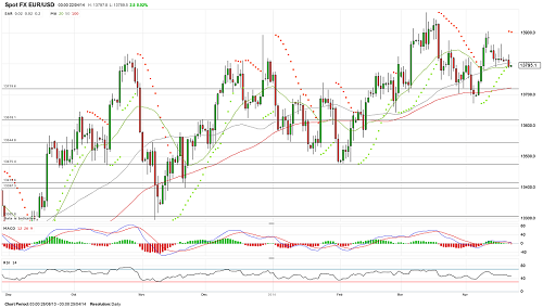
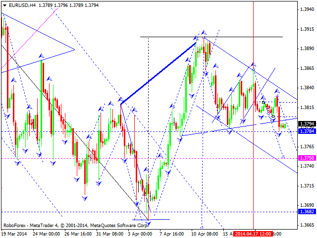
The EURUSD Taking the Risk to Fall to 1.3720

The past week has not brought anything new to the overall picture for the EURUSD. The pair traded in the range limited by the support around 1.3790 and the resistance around 1.3864. Yesterday, it tested the support again but failed to move below. The overall picture as well as indicators is neutral. Only the Parabolic SAR is located above the price chart now that may imply a price decline, its minimum target may be the support near 1.3720. Nevertheless, we should not exclude attempts to increase by the 39th figure that should be considered as an opportunity to open short positions.

eur

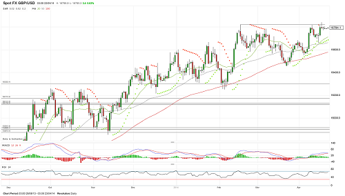
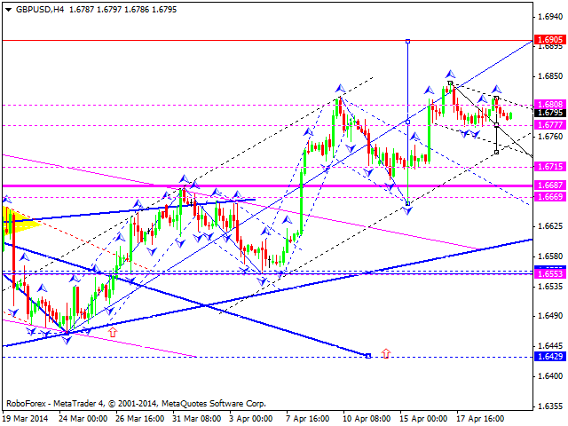
The GBPUSD Attempting to Return to Highs

The GBPUSD was declining at first, but data on labour market in Great Britain returned interest to buy the pound. Due to this the pair found the support around 1.6683, from which it was able to rise to the level of 1.6820, overcame it and tested 1.6842. The upward momentum has not received further development, and the pound appeared below the 68th figure again. Nevertheless, demand for it is kept on dips to 1.6774, and it keeps trying to return to current highs. Despite kept positive towards the pound, its ability to continue rising and to move significantly upward casts doubt. In case of the development of a correction, the support around 1.6700-1.6660 will be a target.

gbp

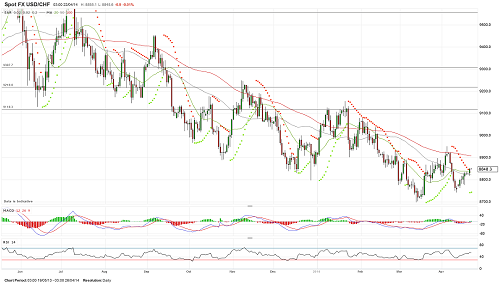
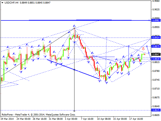
The USDCHF Can Rise To 0.8900

The USDCHF was also in a range. From below its fluctuations were limited by the support around 0.8777, from above by the resistance around 0.8836. With the beginning of this week, the dollar could go slightly higher. Market activity is still at a low level, so it is to wait until it is normalized to be able to objectively evaluate the sentiment of market participants. In general, the dollar looks able to test the 89th figure, rising above which will improve its prospects. Till then one should not exclude testing the 87th figure.

chf

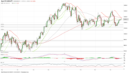
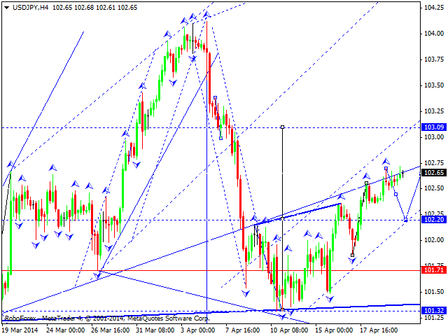
Downside Risks of The USDJPY Are Kept

The USDJPY bears failed to consolidate below 101.59. The dollar has managed to return above the level and rose to 102.56. Despite this, risks to resume a decline are kept. Loss of the 102nd figure will lead to testing the support around 101.59 again, but the yen needs to break below 101.22 to develop a larger correction. A rise above 103.00-103.40 can mean resumption of an ascending trend.

jpy


provided by IAFT


Forex Technical Analysis 22.04.2014 (EUR/USD, GBP/USD, USD/CHF, USD/JPY, AUD/USD, USD/RUB, GOLD)

Article By RoboForex.com

Analysis for April 22nd, 2014

EUR USD, “Euro vs US Dollar”

Euro broke its consolidation channel downwards and today may continue falling down towards level of 1.3750. Later, in our opinion, instrument may move upwards and return to level of 1.3800.

GBP USD, “Great Britain Pound vs US Dollar”

Pound is still moving upwards and forming ascending structure with target at level of 1.6905; right now market is consolidating. If it breaks this consolidation channel upwards, price will reach above-mentioned target. Alternative scenario implies that pair may leave this channel downwards and reach level of 1.6715.

USD CHF, “US Dollar vs Swiss Franc”

Franc is still forming ascending structure with target at level of 0.8800. We think, today price may reach this level, and then start falling down again towards level of 0.8830. Later, in our opinion, instrument may form another ascending structure to renew maximum of this ascending wave.

USD JPY, “US Dollar vs Japanese Yen”

Yen is still moving inside ascending structure with target at level of 103.00. We think, today price may fall down towards level of 102.20 and then start moving upwards to complete this correction. Later, in our opinion, instrument may continue falling down toward level of 100.00.

AUD USD, “Australian Dollar vs US Dollar”

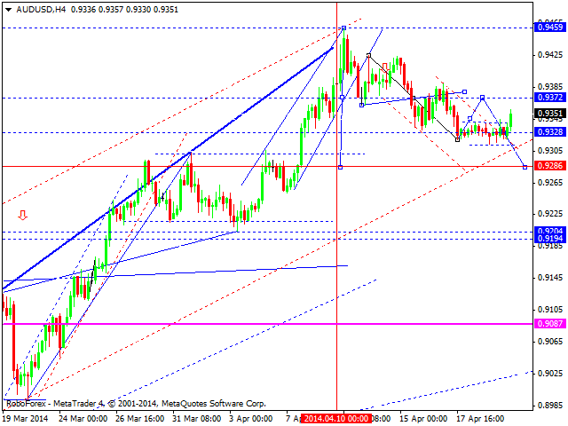
Australian Dollar is returning towards level of 0.9370.  Later, in our opinion, instrument may start forming new descending wave towards next target at level of 0.9286.

USD RUB, “US Dollar vs Russian Ruble”

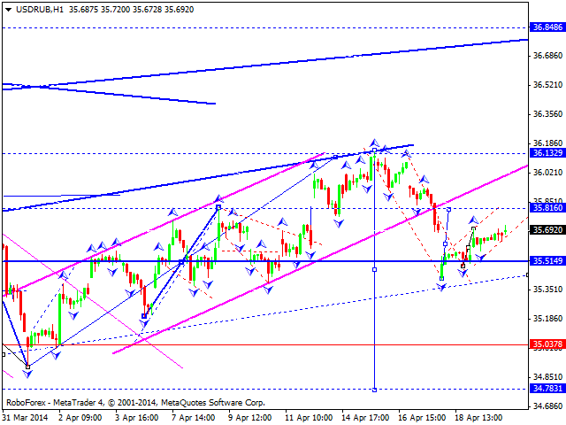
Ruble continues moving upwards. We think, today price may reach target at level of 35.81 and then form another descending structure towards level of 34.78. Later, in our opinion, instrument may continue growing up to reach level of 36.00.

XAU USD, “Gold vs US Dollar”

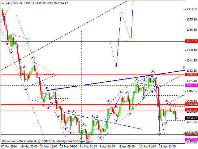
Gold stopped near lower border of its consolidation channel and is still not traded due to the Easter. After market opening, we think price may continue forming ascending structure towards target at level of 1357.

RoboForex Analytical Department

Article By RoboForex.com

Attention!
Forecasts presented in this section only reflect the author’s private opinion and should not be considered as guidance for trading. RoboForex LP bears no responsibility for trading results based on trading recommendations described in these analytical reviews.


Do You Exhibit Shark Behavior Like David Tepper?

By WallStreetDaily.com Do You Exhibit Shark Behavior Like David Tepper?

Meet David Tepper, the world’s greatest investor.

He’s the Founder of Appaloosa Management, a hedge fund with roughly $20 billion under management. He also owns a chunk of the Pittsburgh Steelers.

While Tepper may look tame in photographs, make no mistake…

He’s a shark in the truest sense of the word.

Last year, Tepper annihilated his competition to the tune of 42% returns.

Over the last five years, he’s generated annualized gross returns as high as 50%.

In 2011, Tepper famously bought a $43.5-million beachfront mega mansion in the Hamptons – just so he could tear it down and build a bigger one.

That’s shark behavior!

I love reporting on the movement of sharks here at Wall Street Daily. So Tepper is someone I’ll be tracking closely throughout the year.

Tepper is presently bullish on U.S. stocks, and is especially bullish on the airline industry.

In fact, Tepper presently owns a massive position in United Airlines (UAL).

He doesn’t hesitate to make monster bets on technology, either.

Tepper previously made a killing on Apple (AAPL), and now owns roughly 236,709 shares of Google (GOOGL), having just added to the position.

But here’s the rub…

Tepper has very obviously recalibrated his trading strategy toward the lightning-quick adoption of new technologies.

Put simply, old rules no longer apply when it comes to tech investing.

You must exhibit shark behavior, which means striking fast.

Bottom line, to mimic the investment success that Tepper is having with technology companies, there’s one subtle nuance to realize.

Below is a “must see” video my staff just produced that perfectly captures this infinitely important subtlety.

Oh, and the video covers everything in less than four minutes.

Cheers to that!

Robert Williams,
Founder, Wall Street Daily

Shark_TN_1

Transcript:

With technology advancing faster than ever, it’s absolutely essential that investors are able to distinguish between the truly disruptive, long-lasting technologies and ones that are just overhyped, passing fads.

And it’s important to do so early in order to maximize profits.

With the general population becoming more tech-savvy and demanding more disruptive technologies, the adaptation of new technologies is happening faster than ever.

Need proof? Just look at the graph, which shows the time it took for major disruptive technologies to gain mass adoption over the past century.

As you can see, technology was slow to catch on with the general public at the turn of the 20th century.

Take electricity, for example – one of the most disruptive technologies in American history. It took approximately 35 years just to reach 70% saturation in U.S. households!

But as we move to newer technologies, like the refrigerator, you’ll notice that the adoption time shortens. It might not seem like it today, but at the time, the refrigerator was a truly disruptive technology. People no longer had to buy ice for their iceboxes. They just plugged in their new refrigerators, and they were set.

The U.S. ice trade was valued at $28 million at the time. When adjusted for inflation, that’s a $660-million industry, wiped out, as households no longer needed ice to keep food fresh. Not only that, but people were able to keep their food at a specific temperature, preventing diseases and saving millions of dollars in spoiled food. Yet this technology still took 25 years to reach 70% adoption.

Another example: color television. While it took a few years to catch on with the general public, you can see that as soon as it did, it happened much faster. It took approximately 15 years to reach 70% saturation in U.S. households.

Its fellow living room innovation – the VCR – took only 10 years to reach saturation. And that was after a sluggish start, due to the highly publicized competition with Betamax tapes.

As we move closer to the present day, you can see how much faster the public adopts new technologies. Air conditioning, the microwave, cellphones…

Now, what about the internet, arguably the most disruptive technology introduced to the American people in history! Well, in 1997, the U.S. Census Bureau started researching the number of households with the internet. It only took 12 years for the internet to reach 70% saturation in U.S. households.

Or the first major release of a smartphone – Apple’s original iPhone in June 2007. By 2013, over 60% of Americans had a smartphone. That’s only six years to reach 60% saturation!

The takeaway here? Technological innovation is happening faster than ever – and so is public adoption.

As an investor, you need to be more aware of the changing consumer technology space, as there are outstanding fortunes to be made on innovative, disruptive technologies being developed. And you stand the best chance of becoming significantly wealthier if you’re able to identify disruptive technologies early, so you can jump on board before everyone else does – and before the technology gains mass adoption. Keep in mind that by the time you see new technologies showing up in the majority of U.S. households, it’s likely too late.

The post Do You Exhibit Shark Behavior Like David Tepper? appeared first on Wall Street Daily.

Article By WallStreetDaily.com

Original Article: Do You Exhibit Shark Behavior Like David Tepper?

Japanese Candlesticks Analysis 22.04.2014 (EUR/USD, USD/JPY)

Article By RoboForex.com

Analysis for April 22nd, 2014

EUR USD, “Euro vs US Dollar”

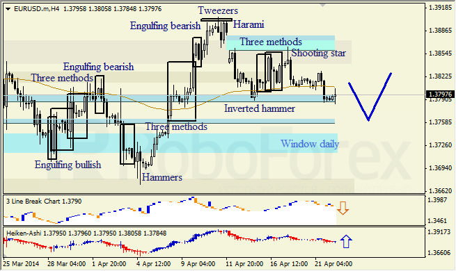
H4 chart of EUR USD shows descending movement, which is indicated by Shooting Star pattern near resistance from upper Window. Middle Window is support level. Three Line Break chart confirms descending movement; Heiken Ashi candlesticks indicate possibility of bullish pullback.

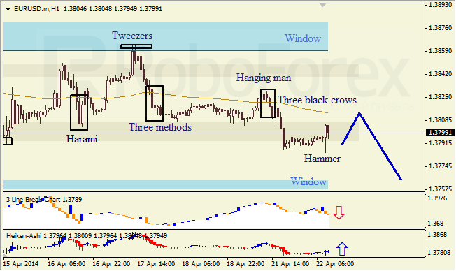
H1 chart of EUR USD shows bearish tendency, which is indicated by Hanging Man and Three Black Crows patterns. Lower Window is support level. Three Line Break chart confirms bearish movement; Hammer pattern and Heiken Ashi candlesticks indicate possibility of bullish pullback.

USD JPY, “US Dollar vs Japanese Yen”

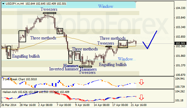
H4 chart of USD JPY shows ascending movement, which is indicated by Three Methods continuation pattern. Three Line Break chart and Heiken Ashi candlesticks indicate bearish pullback.

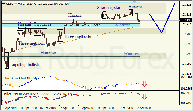
H1 chart of USD JPY shows correction within ascending trend, which is indicated by Harami pattern. Three Line Break chart and Heiken Ashi candlesticks confirm descending movement.

RoboForex Analytical Department

Article By RoboForex.com

Attention!
Forecasts presented in this section only reflect the author’s private opinion and should not be considered as guidance for trading. RoboForex LP bears no responsibility for trading results based on trading recommendations described in these analytical reviews.


Why Even the Bears Should Buy Stocks Now

By MoneyMorning.com.au

It has been a scary few weeks for stocks.

There has been almost non-stop talk of the so-called tech ‘bubble’; bursting.

Add to this the ongoing rumbles in Ukraine, worries about slowing growth in China, and the prospects of Australia entering a recession, and it’s no wonder stocks have fallen.

Even so, what’s the damage?

As it turns out, for most investors it hasn’t been much more than a tiny cut to the flesh.

In fact, since the start of the year the Australian S&P/ASX 200 index is still up 1.9%, and for all the talk of the tech bubble crashing, the NASDAQ index is down just 1.94%.

Should investors see this as a mild tremor before the big event, or should you just ignore the noise and get on with investing?

Here’s our take…

Your editor is in the final week of our three-week stint in Los Angeles, California, one of the earthquake capitals of the world.

According to recent reports, California is due a ‘big one’. This weekend saw an earthquake in Mexico that measured as a magnitude of 7.2. And the two weeks prior to our arrival here saw a number of small-scale temblors that some thought could be a warning sign.

A similar story has played out in the stock market. Investors are looking at all sorts of events and stories and wondering if this is the precursor to the big stock market crash.

If an 8% drop in the NASDAQ is your definition of a crash then that’s what you’ve seen over the past month. But an 8% drop isn’t that uncommon. The issue is what will happen next. That’s where the bearish investors have consistently gotten this market wrong.

Same views, different targets

To be fair, there isn’t that much difference between your editor’s bullish view and many of the ultra-bearish views you see.

That may seem like an odd comment. Your editor is calling for the Australian Share Market to more than triple over the next five years. By contrast our old pal Vern Gowdie has the market falling 90% from today’s levels.

So how can it be possible that our views aren’t that far apart?

The reason is simple: we both see big structural problems with the world economy. We both see that the current boom is simply a result of boom and bust policies (increased credit).

One day that will mean the boom will turn to a bust. We both agree with that. The difference is that your editor believes that the boom has only just started. As a result we’re betting on Aussie stocks to more than triple over the next five years.

One reason for that boom will be the rapid growth of China and other emerging markets. Keep an eye out for more commentary on this from our new emerging markets analyst Ken Wangdong.

On the other side, Vern believes the market is about to hit the skids.

Anyway, getting back to the 8% NASDAQ drop. It’s one thing to have a long-term view on stocks; it’s another thing to take advantage of what have so far turned out to be short-term dips.

This is why we believe it’s much harder to be a bearish investor in this market — it’s much harder to make the most of the volatility.

Here’s why…

Own stocks to boost returns

When you’ve got an overall bullish view of the stock market you can afford to sit through the short-term dips.

You get to cash in any dividends you may get from income stocks, plus you can use spare cash to increase your stock position at a cheaper price.

If the market then reverts to an uptrend then you also get the benefit of capital growth.

On the other hand, for short sellers to play the same game on the short side it means they either have to be always short — which means they’ll accumulate a losing position in an up-trending market — or they need to time the market by shorting and then buying back the stock as the market hits the peaks and troughs.

That’s not impossible, but it’s tough unless you use the right trading tools.

Of course, if you believe the market is heading south it’s hard to justify buying stocks. But it’s also worth asking, what if you’re wrong?

What if stocks don’t collapse?

What if the market continues to rise? Or what if the market even just goes sideways for a long time?

It’s worth asking that question because there can be a big difference between staying in cash and having a combination of cash and dividend-paying stocks. For a start, a cash investment will likely give you no better than a pre-tax 4% income stream.

Meanwhile, a good dividend-paying stock can give you a pre-tax income stream of 6%, 7% or even 8%. It’s why even if you have bearish tendencies, in our view it still makes a lot of sense to invest at least a small portion of your investable assets in stocks.

For most investors we recommend up to 50% in stocks. But even starting off with a 5% or 10% exposure in this volatile market is a good start. That’s especially so after stocks have sold off. It could make a big difference over the next few years as you look to build your wealth.

Cheers,
Kris

From the Port Phillip Publishing Library

The Daily Reckoning: Losing Confidence in the US Dollar

Join Money Morning on Google+


By MoneyMorning.com.au